When I joined the ION* account, the brand's visual identity wasn't keeping up with the product. The creative direction was to evolve the look to "complement the beauty found in nature" and align with a new bottle redesign built around gradients and brighter colors.
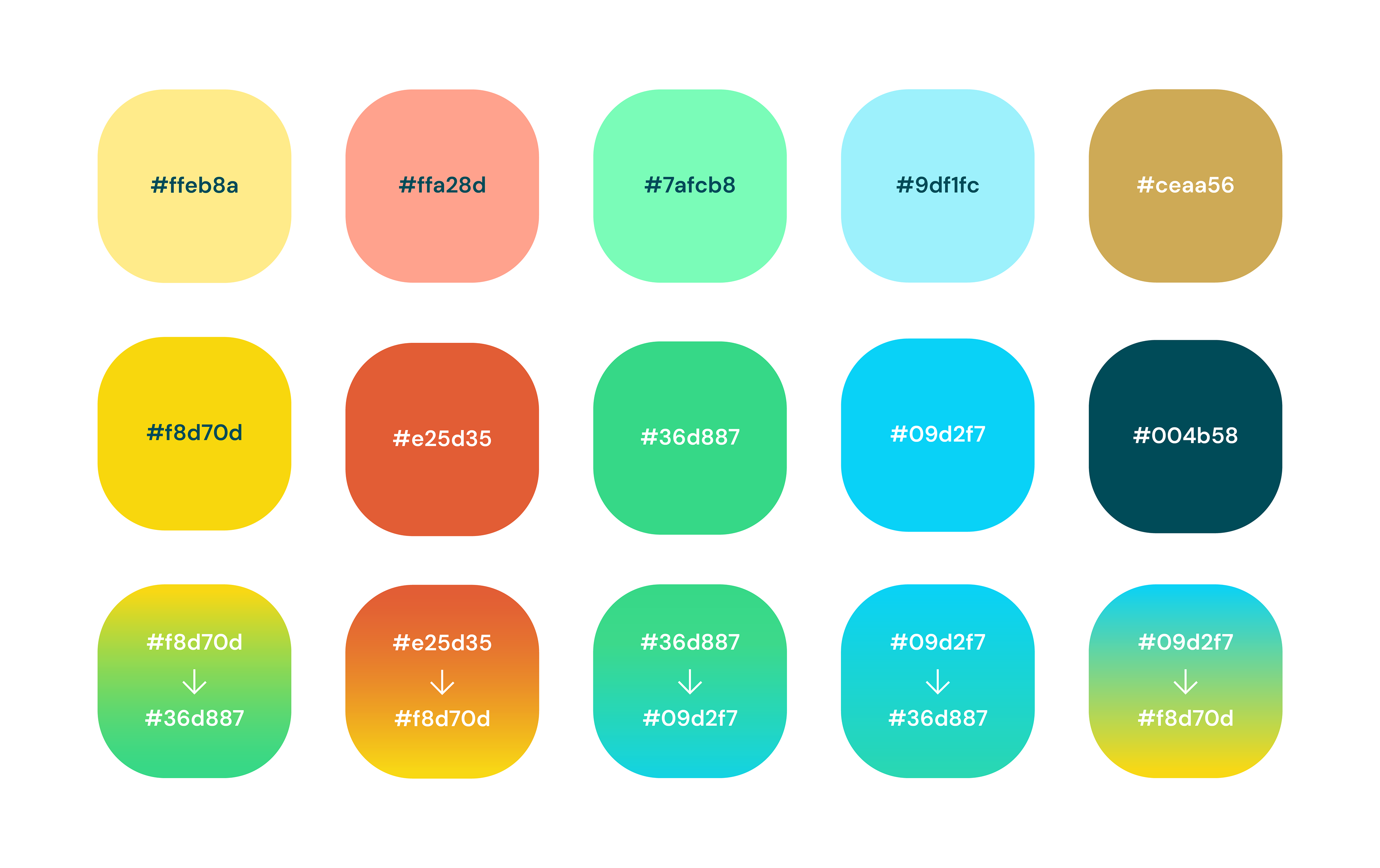
From that brief, I developed a refreshed visual system, warm gradients, expressive typography, and a vibrant color palette, and rolled it out across promotional email, paid and organic social, landing pages, and product education campaigns. Every asset had to balance bright, consumer-friendly energy with credible health and wellness messaging.
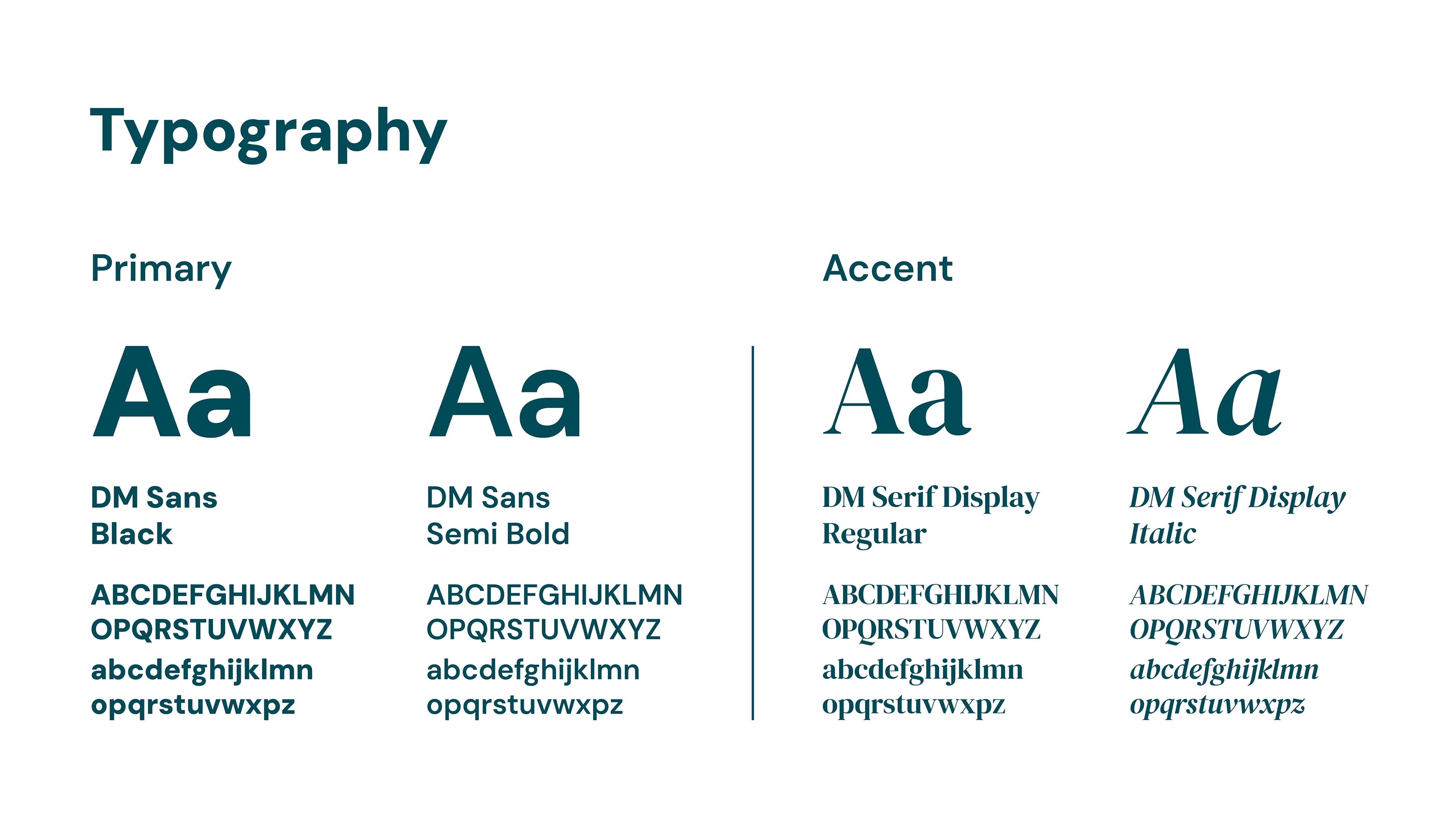
The typography pairing, DM Sans for clarity and DM Serif Display for warmth, was chosen to reflect the brand's dual identity: science-backed and approachable. The bold sans anchors promotional content and CTAs, while the serif accent adds personality to headlines and educational messaging. Together, they replaced a more clinical typographic approach and set the tone for a brand that feels human first.
Promotional Email Campaigns
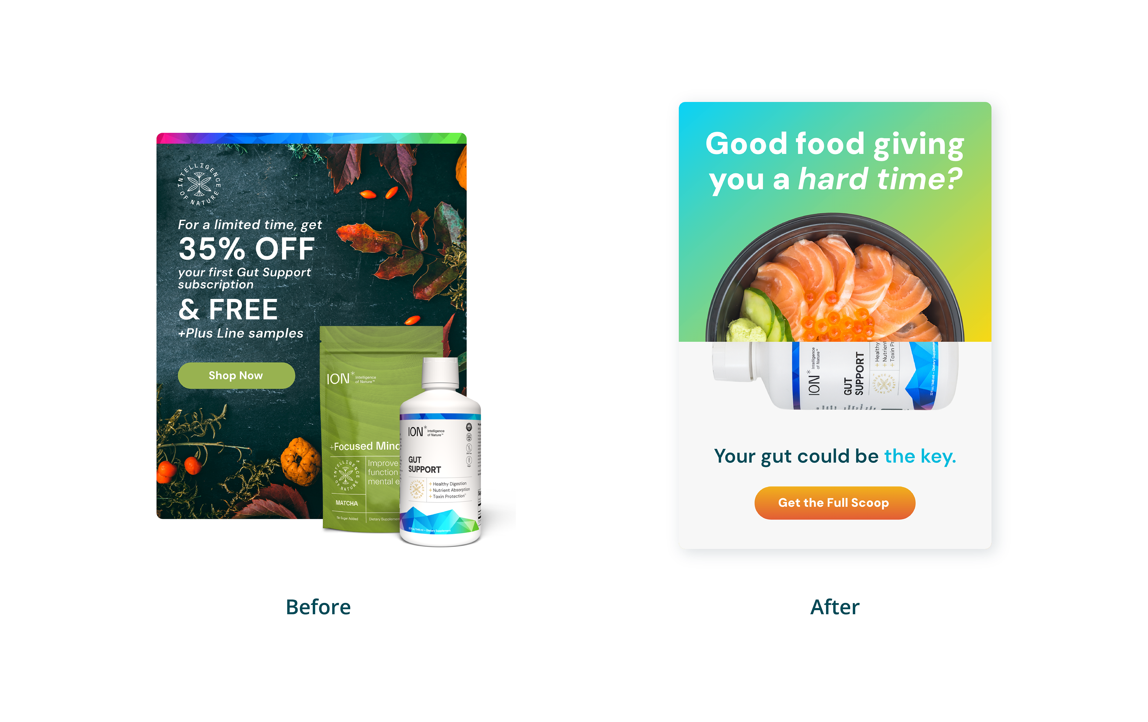
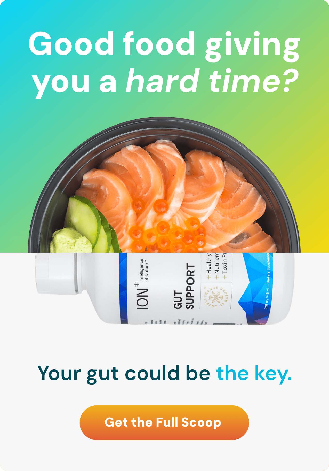
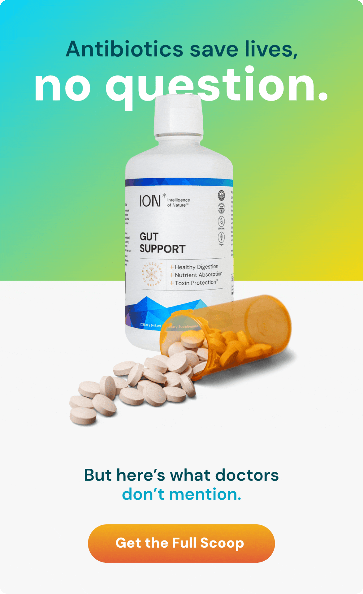
Every email followed a consistent structure: a bold, question-driven headline to stop the scroll, a hero image grounded in real food photography, a subheading that reframes the problem around gut health, and a clear CTA.
This anatomy kept the brand voice tight across dozens of sends while giving each campaign enough flexibility to speak to different audiences and product angles.
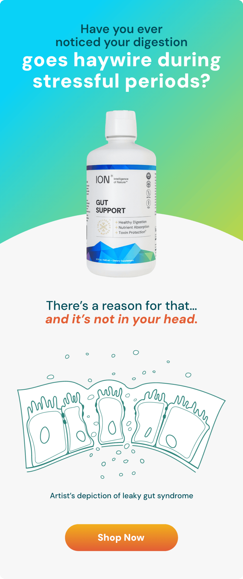
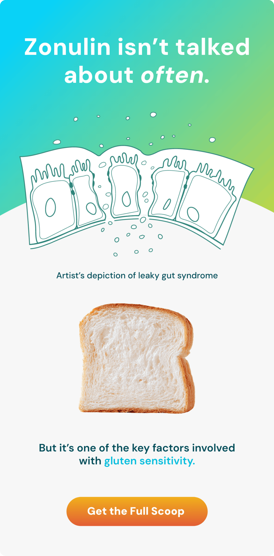
The educational emails took a different approach, leading with a health question or concept rather than a promotion. These were designed to build trust and authority, using custom gut health illustrations and accessible language to explain complex science. The goal was to position ION* as a brand that teaches first and sells second.
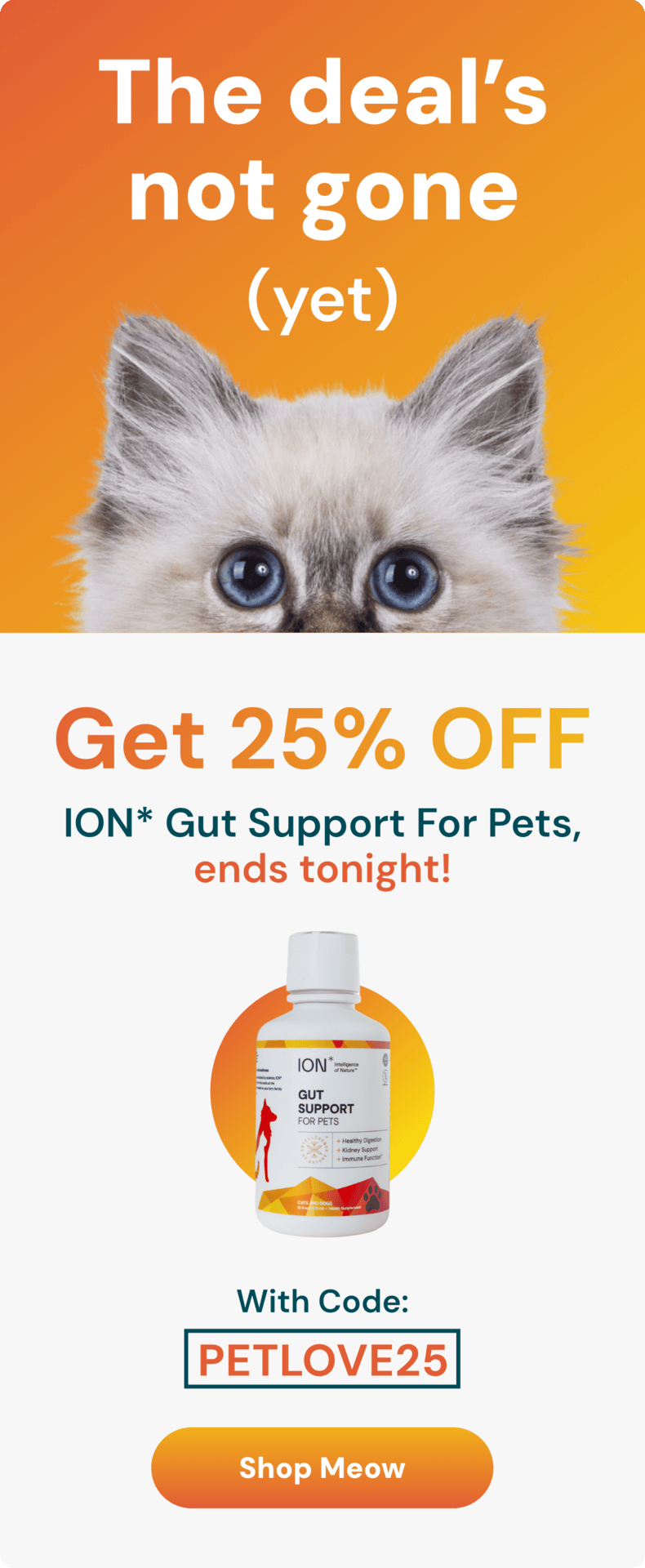
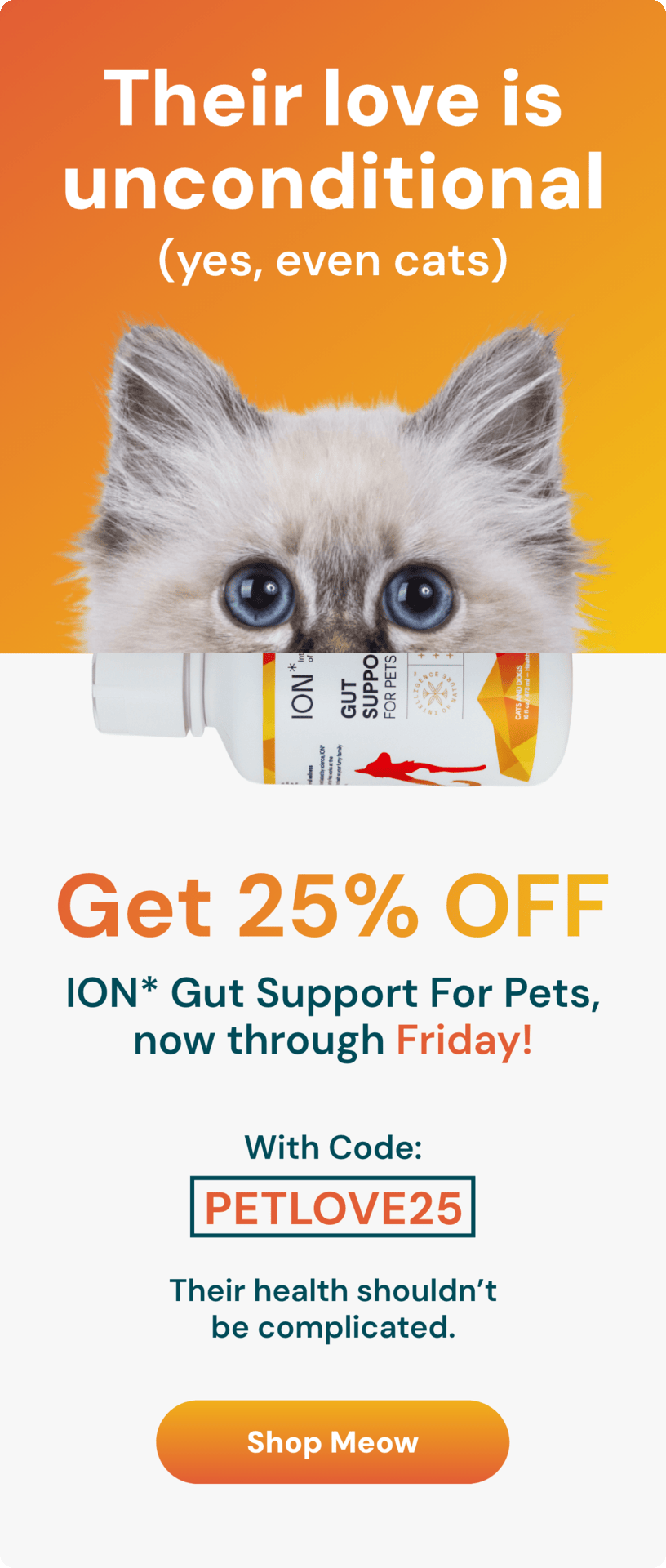
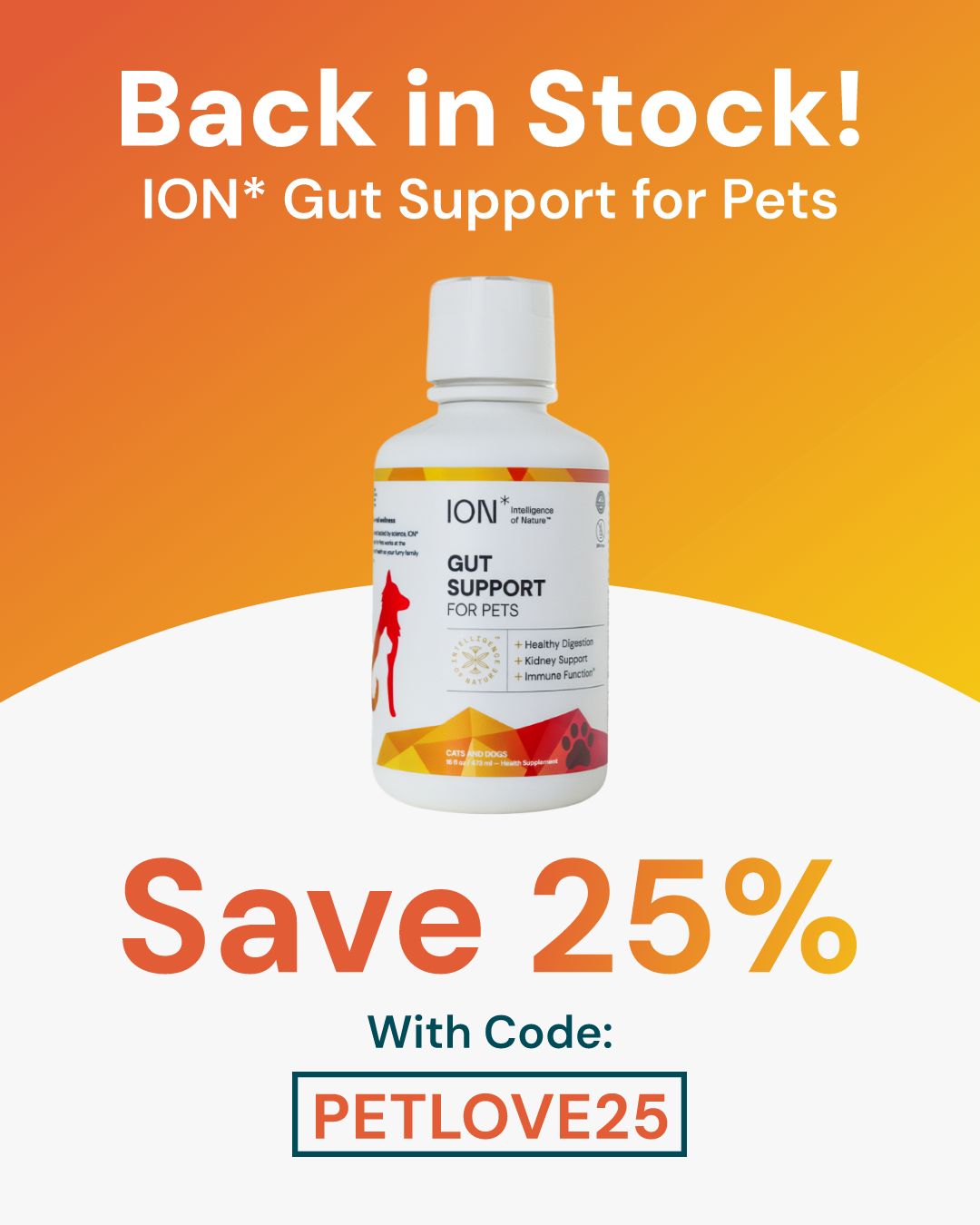
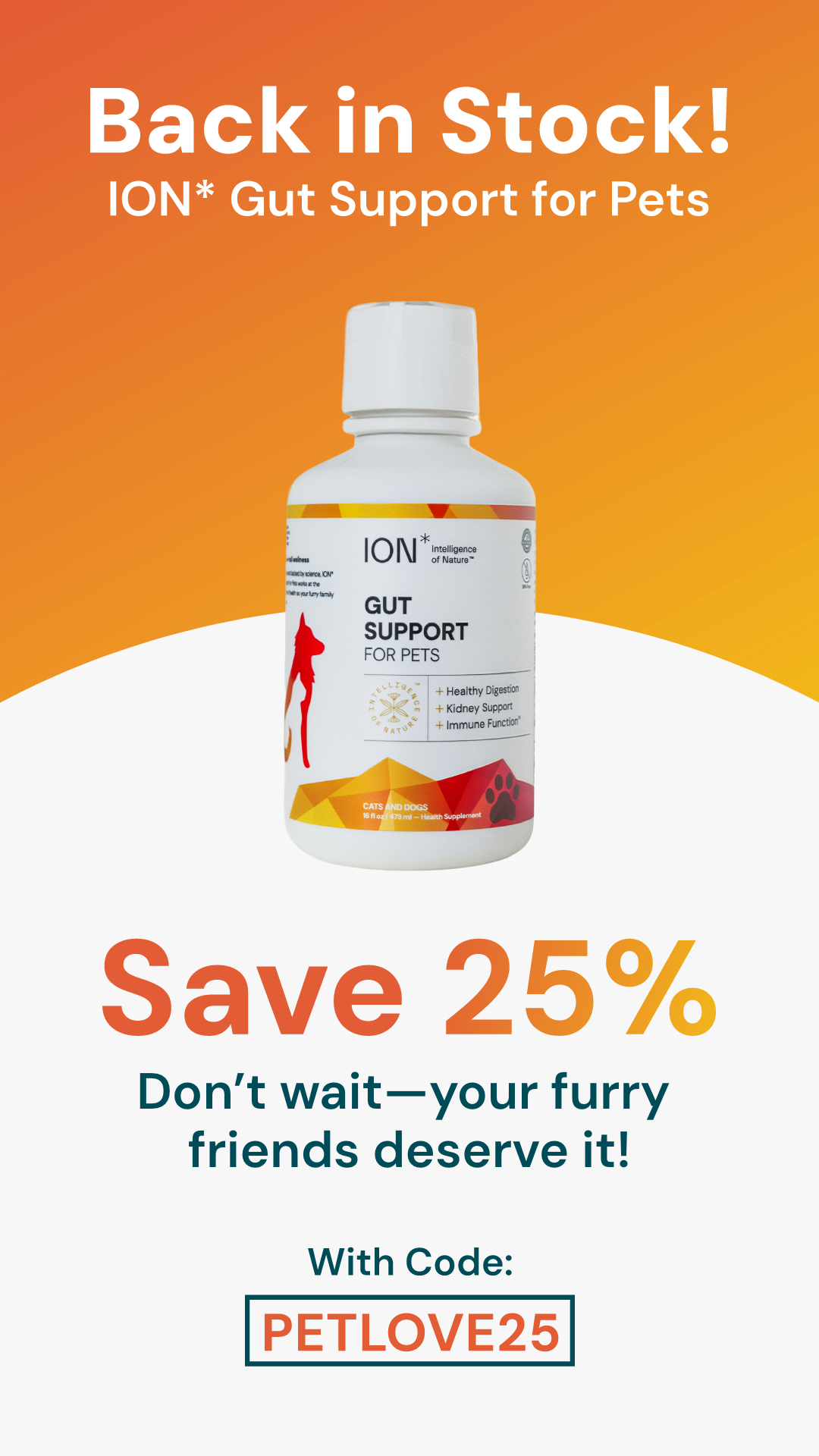
Pet Emails and Social Ad Creative
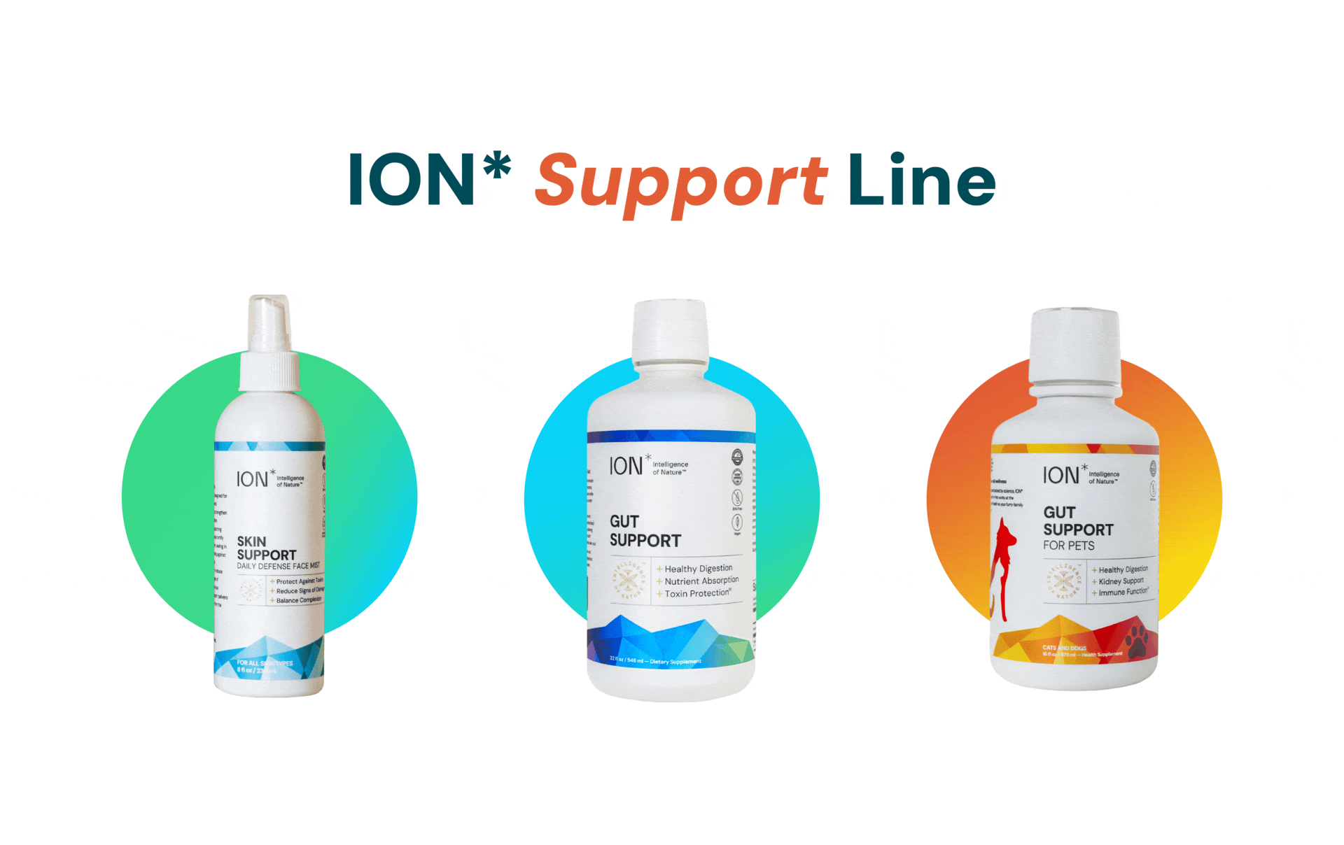
ION*'s pet line needed its own voice within the brand, playful enough to stand apart from the human products, but still visually consistent with the broader system. The warm orange gradient became the pet line's signature, and the copy leaned into humor ("yes, even cats") to match the energy of the audience. The campaign ran across email, Instagram Stories, and grid posts, with each format adapted to its platform while keeping the promo structure and visual language intact.
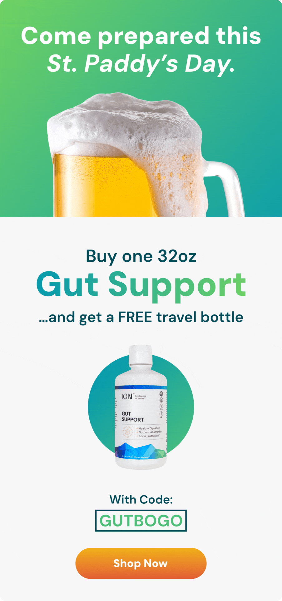
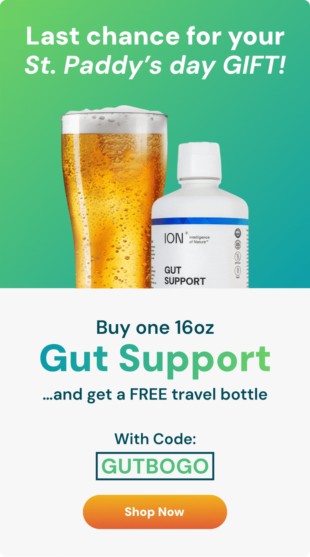
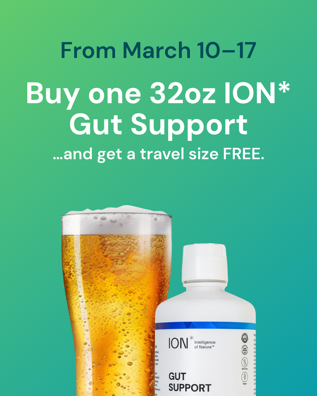
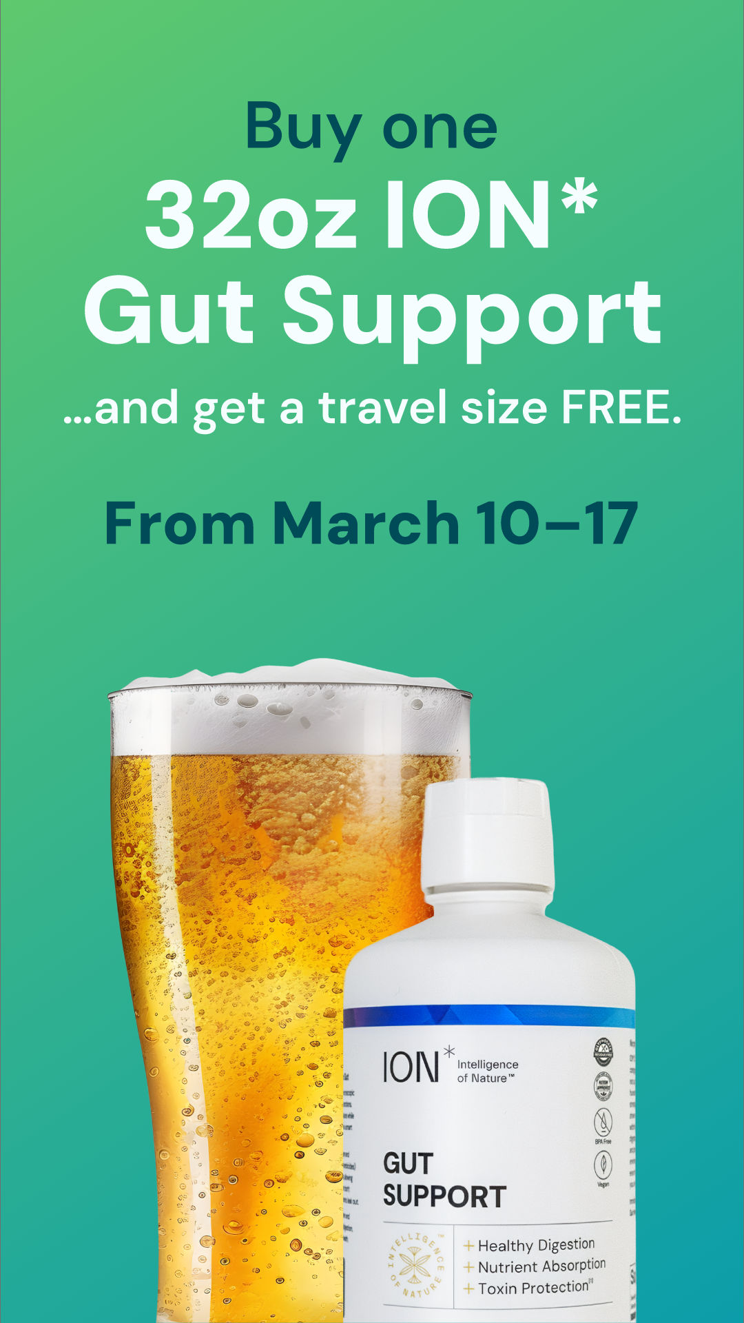
St. Paddy's Day Emails and Social Ad Creative
Seasonal campaigns like St. Patrick's Day gave the brand a chance to have fun while staying on-message. The team swapped in a special green gradient for the holiday, a subtle shift that made the campaign feel festive without breaking the broader visual system. The beer imagery tied the holiday to gut health in a way that felt natural rather than forced, and the same promotion was adapted across email, Instagram Stories, and grid posts, each reformatted for its platform but part of the same campaign.
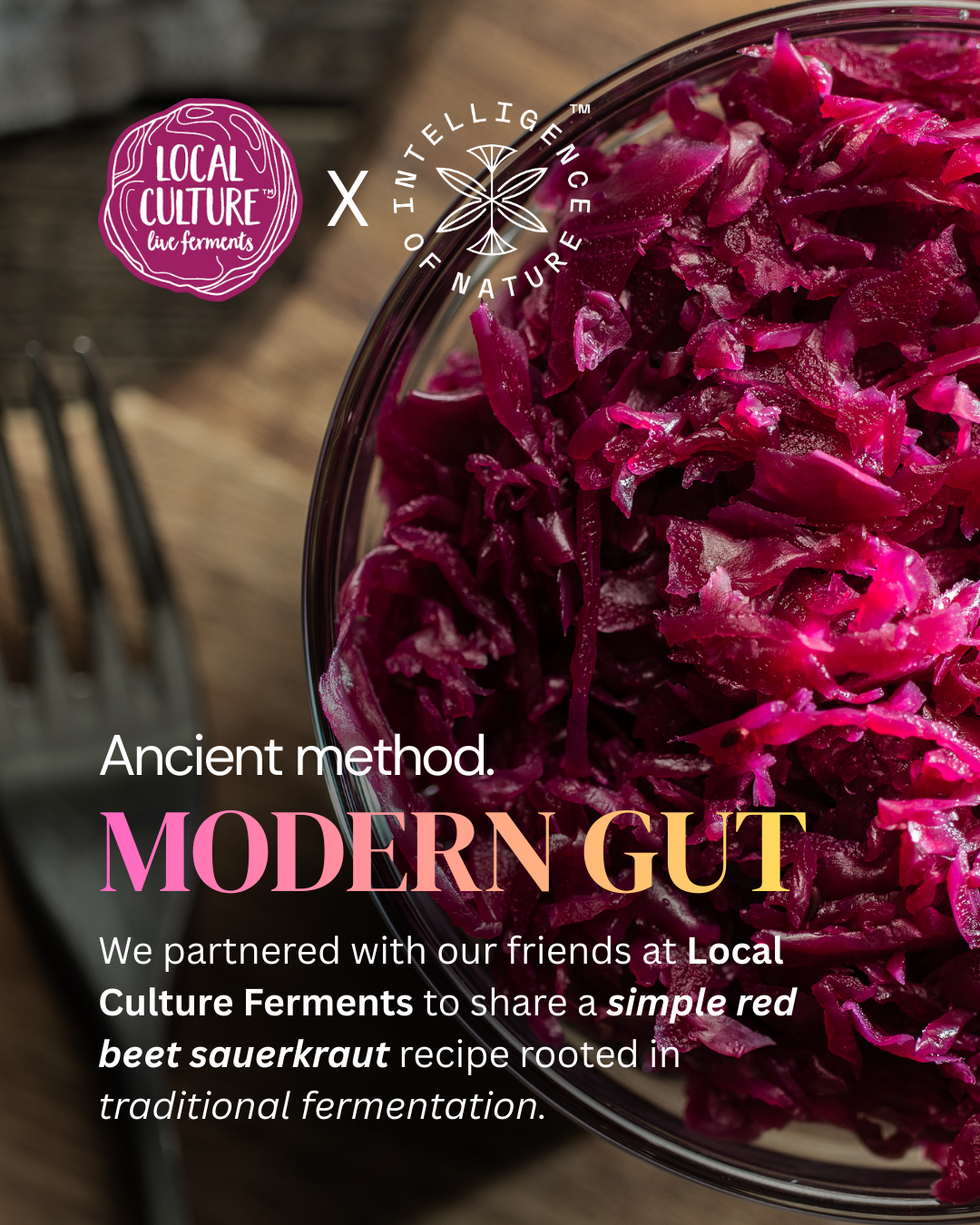
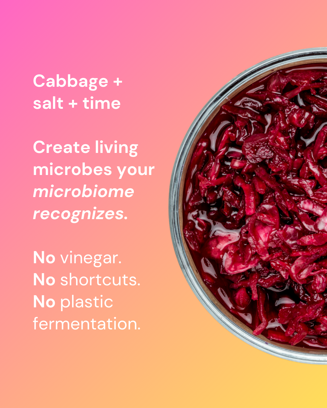
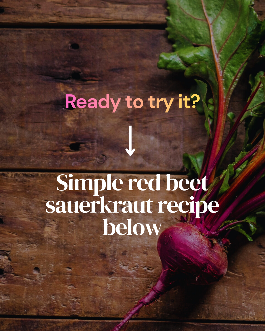
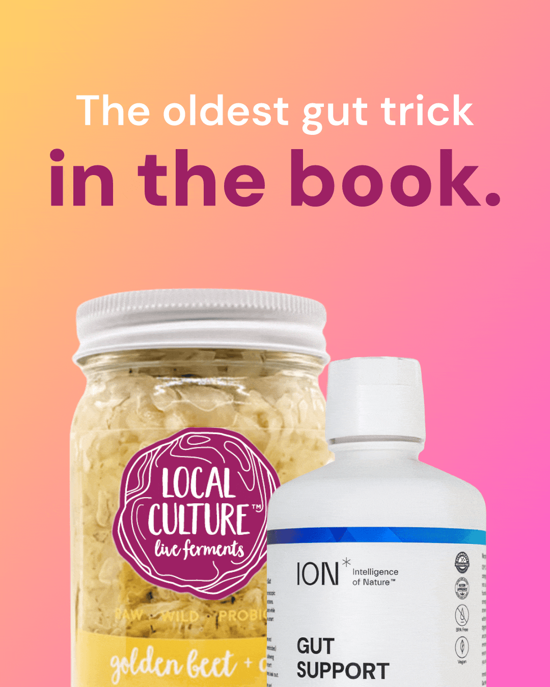
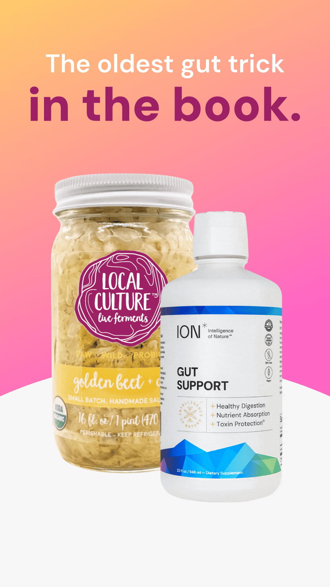
Collaboration with 'Local Culture Live Ferments'
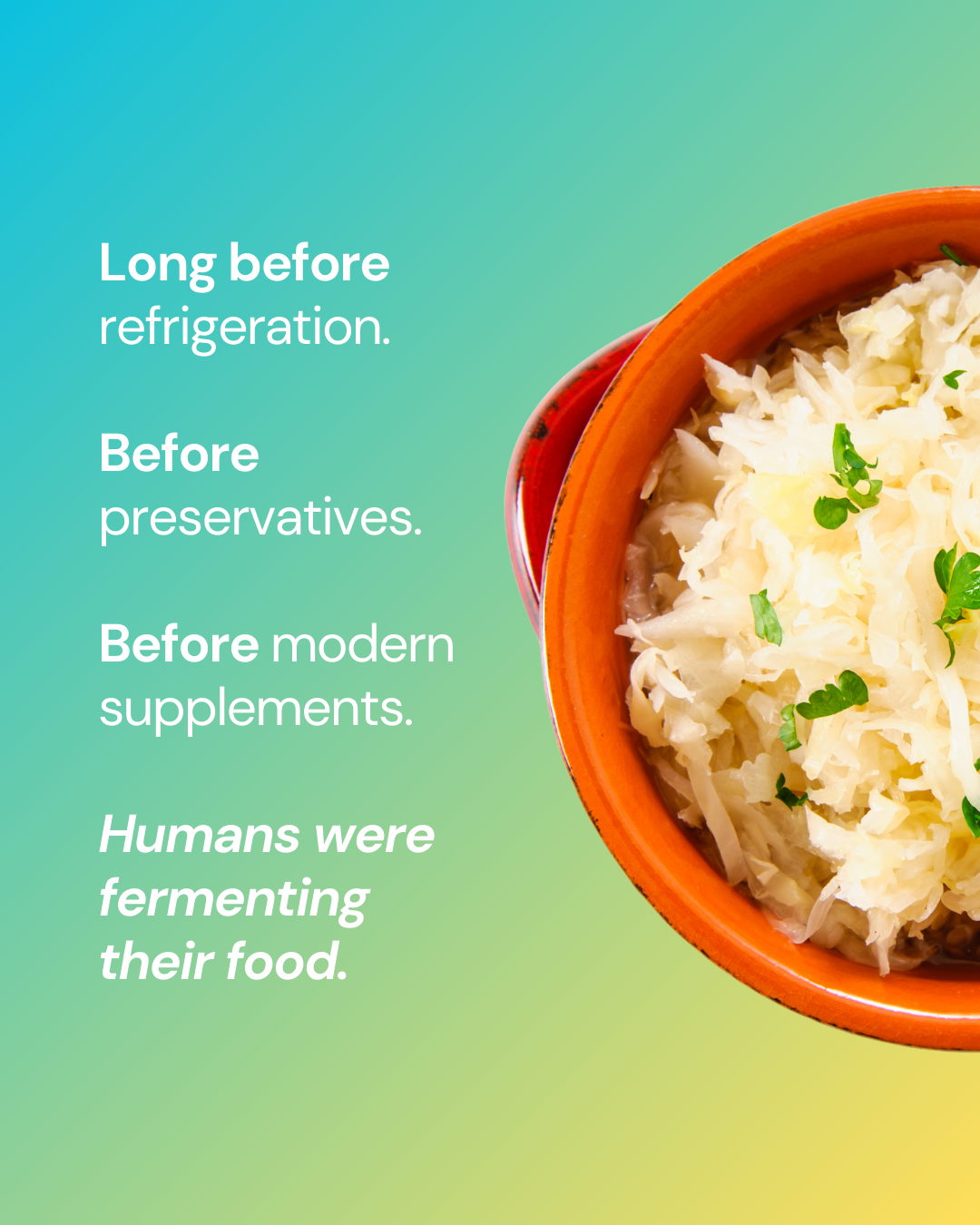
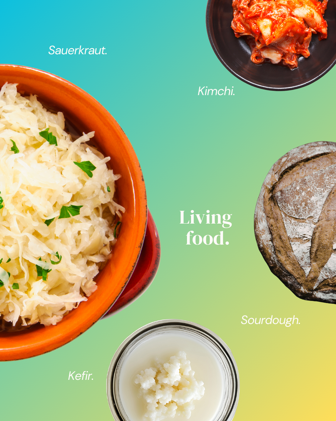
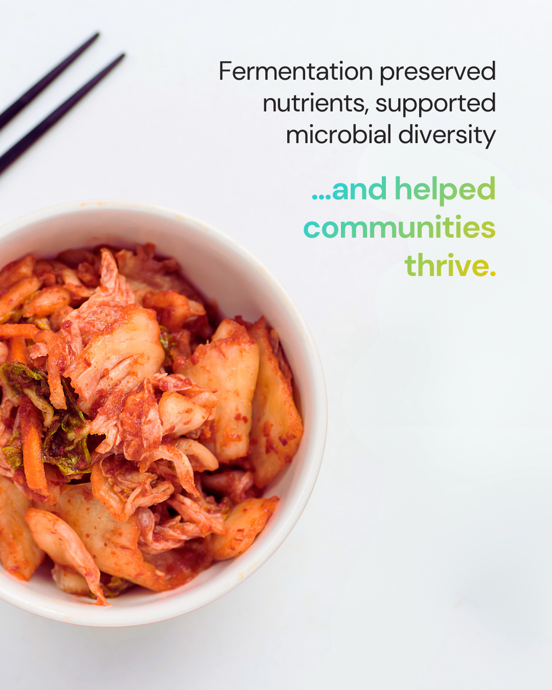
ION* partnered with Local Culture Live Ferments for a co-branded campaign rooted in a shared philosophy: gut health starts with real food. The social carousel walked viewers through the history and science of fermentation, ending with a simple red beet sauerkraut recipe, content designed to educate rather than sell.
The ad creative paired both products together, using a warm pink-to-coral gradient built from Local Culture's brand colors, distinct from the core ION* palette but still at home within the broader visual system.
Organic Social Creative
Ad Social Creative: Story and Grid Post
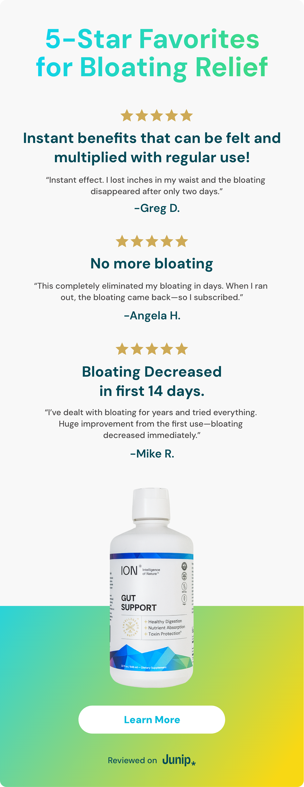
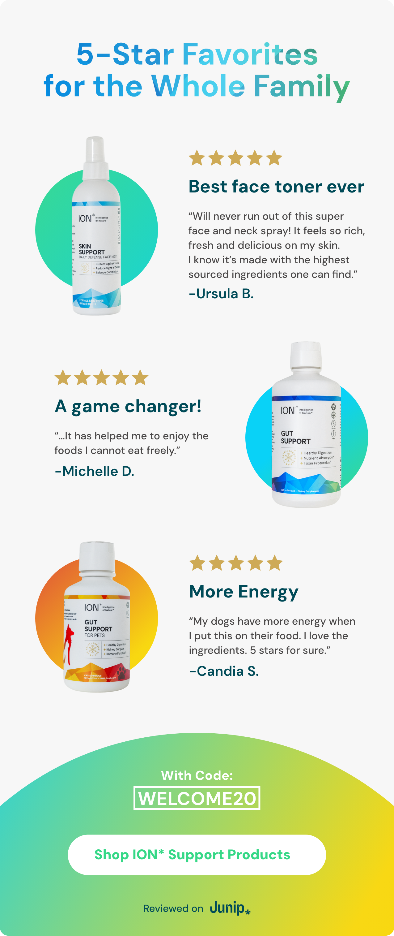
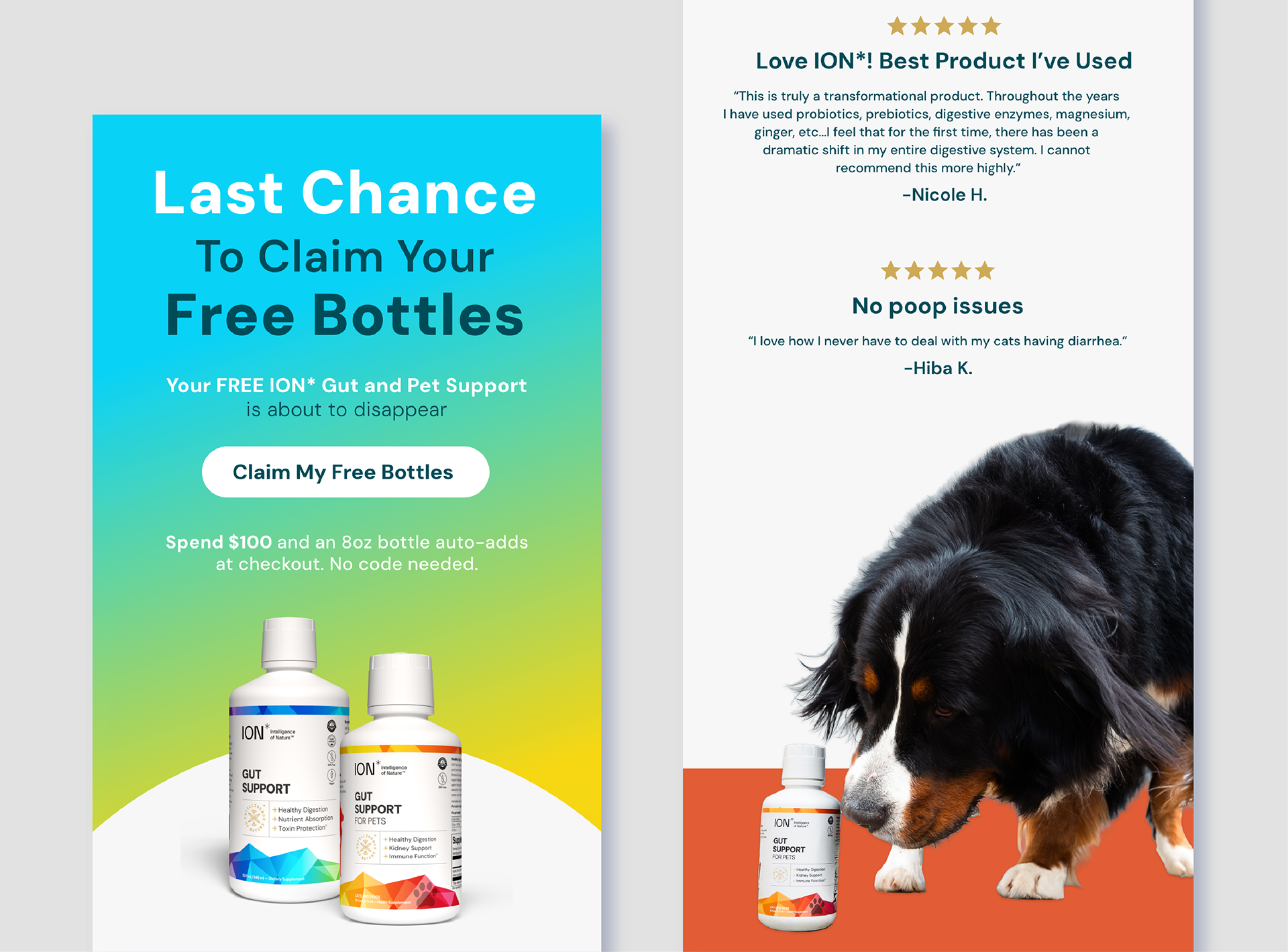
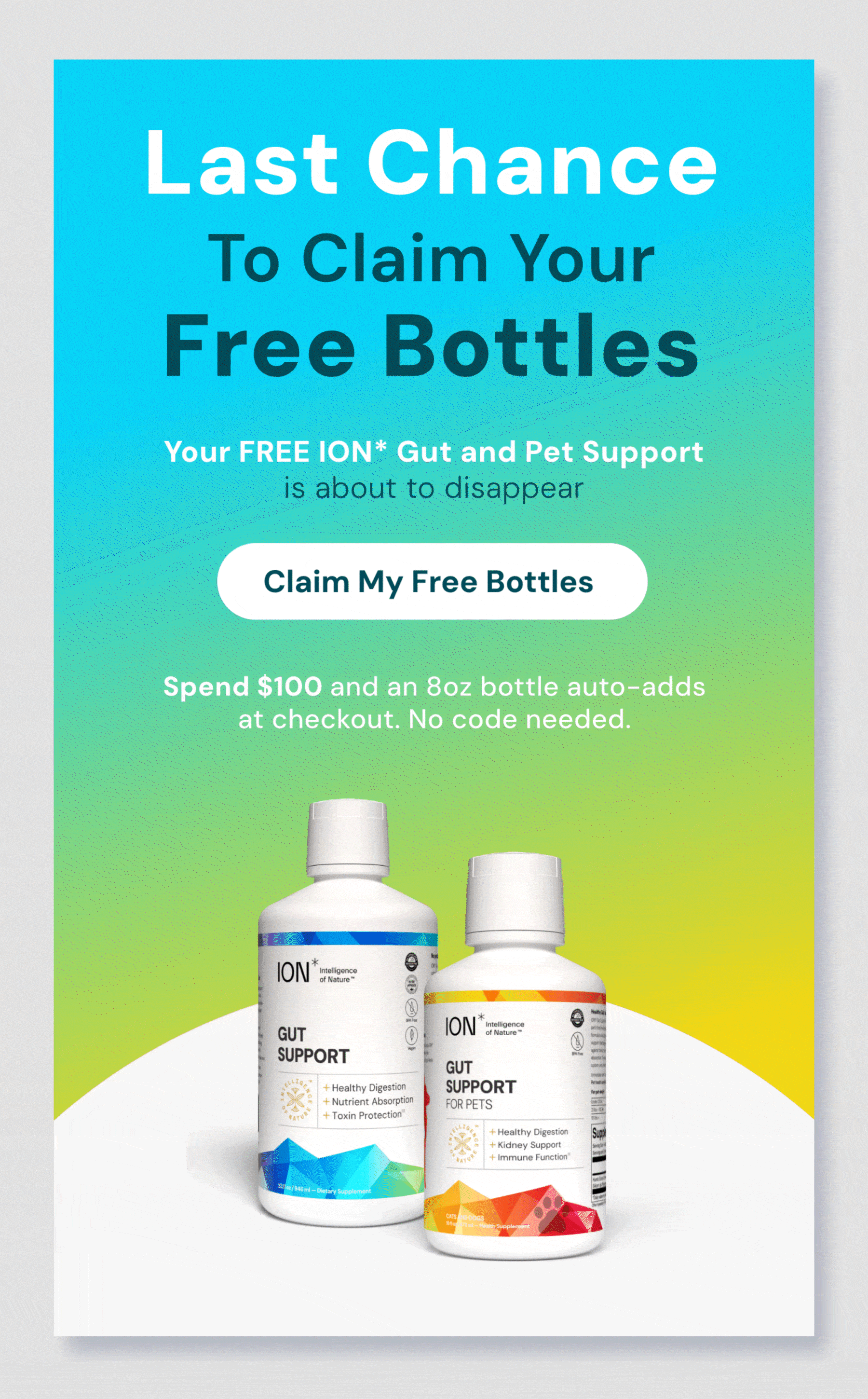
Review Email Campaigns
Review-driven emails served a different strategic purpose, using social proof to convert skeptical or new customers. Each email was organized around a specific product or benefit, with real customer testimonials doing the selling. The layout kept the brand's gradient system and typography intact while letting the five-star ratings and customer voices take center stage.
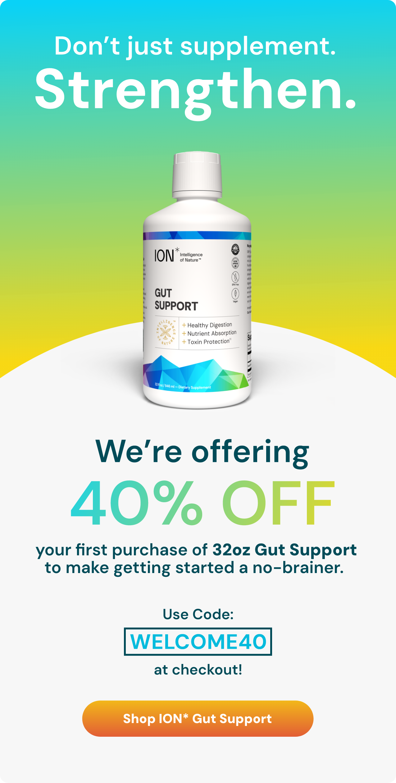
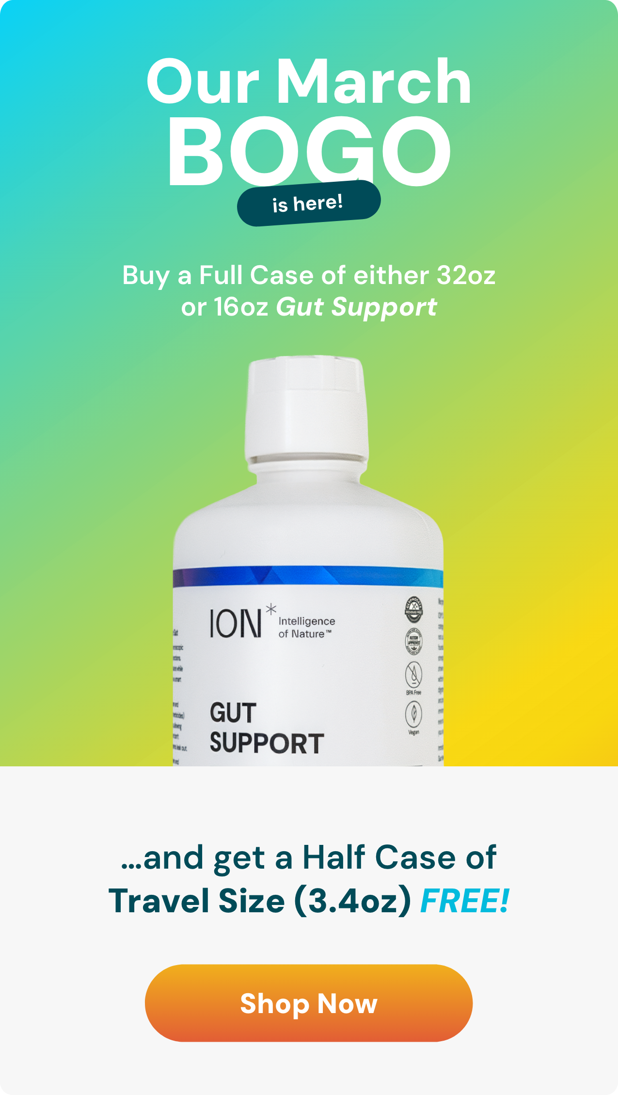
Sale Email Campaigns
Sale emails had one job: drive conversions fast. The design leaned into bold typography and high-contrast headlines to create urgency, while the gradient backgrounds and product photography kept everything visually anchored in the brand. Whether it was a welcome discount or a monthly BOGO, the layout prioritized clarity, offer, product, code, CTA, so nothing stood between the reader and the checkout.
Long-Form Promotional Emails
The long-form emails combined multiple campaign strategies into a single send, promotion, social proof, and product education all in one scroll. This format gave hesitant customers everything they needed to convert without clicking away, while the sectioned layout and consistent gradient system kept the email feeling cohesive rather than overwhelming.
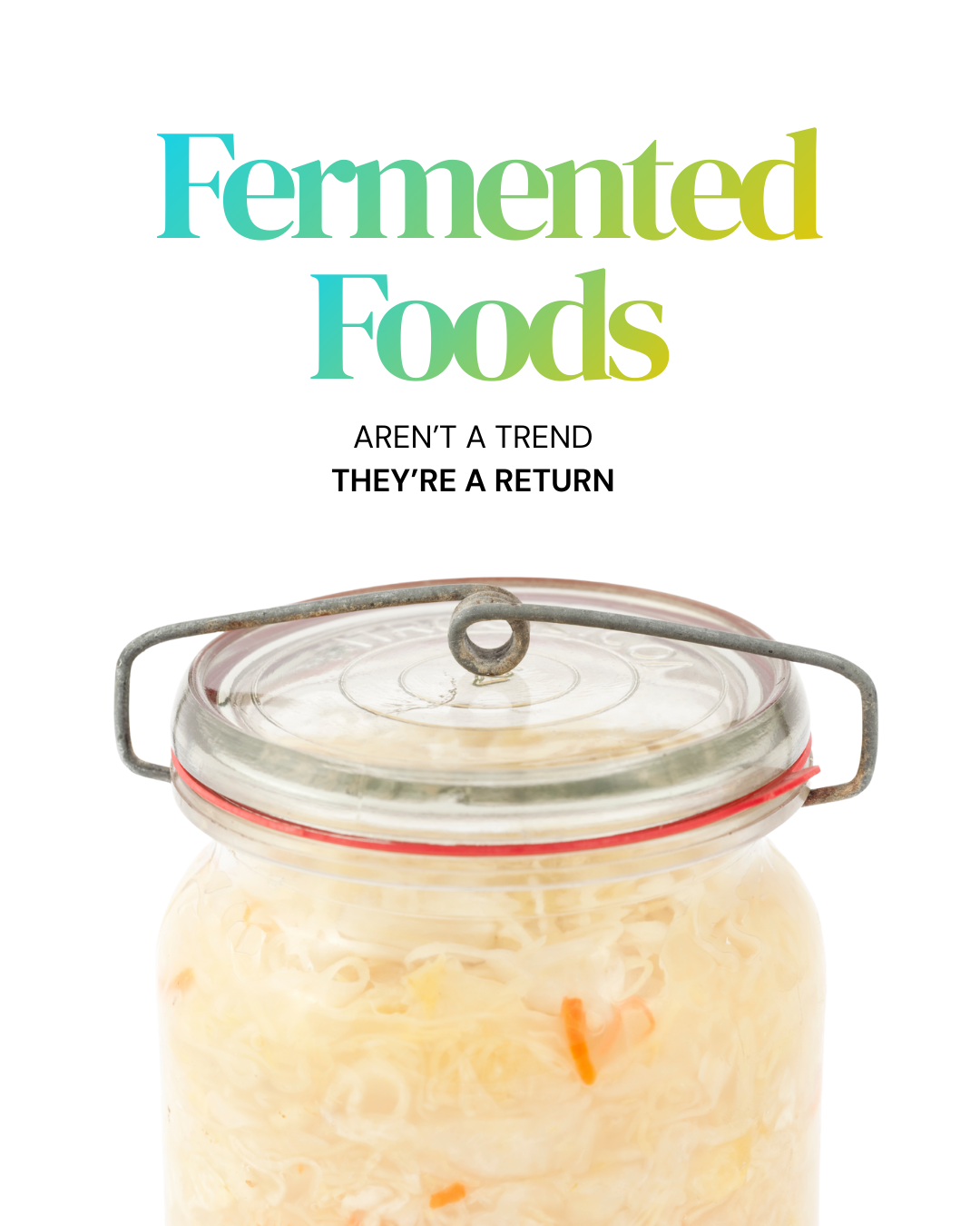
Organic Social Creative
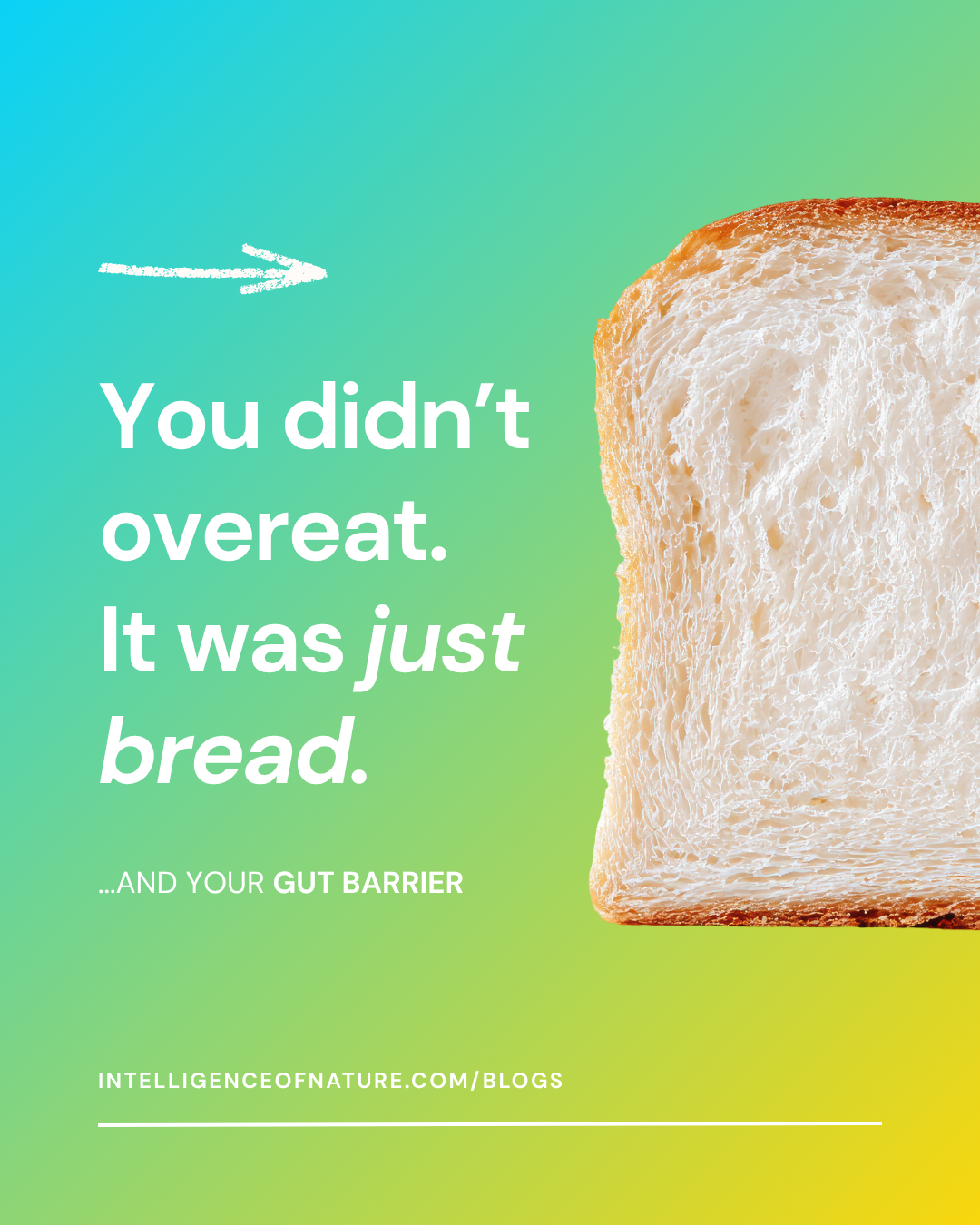
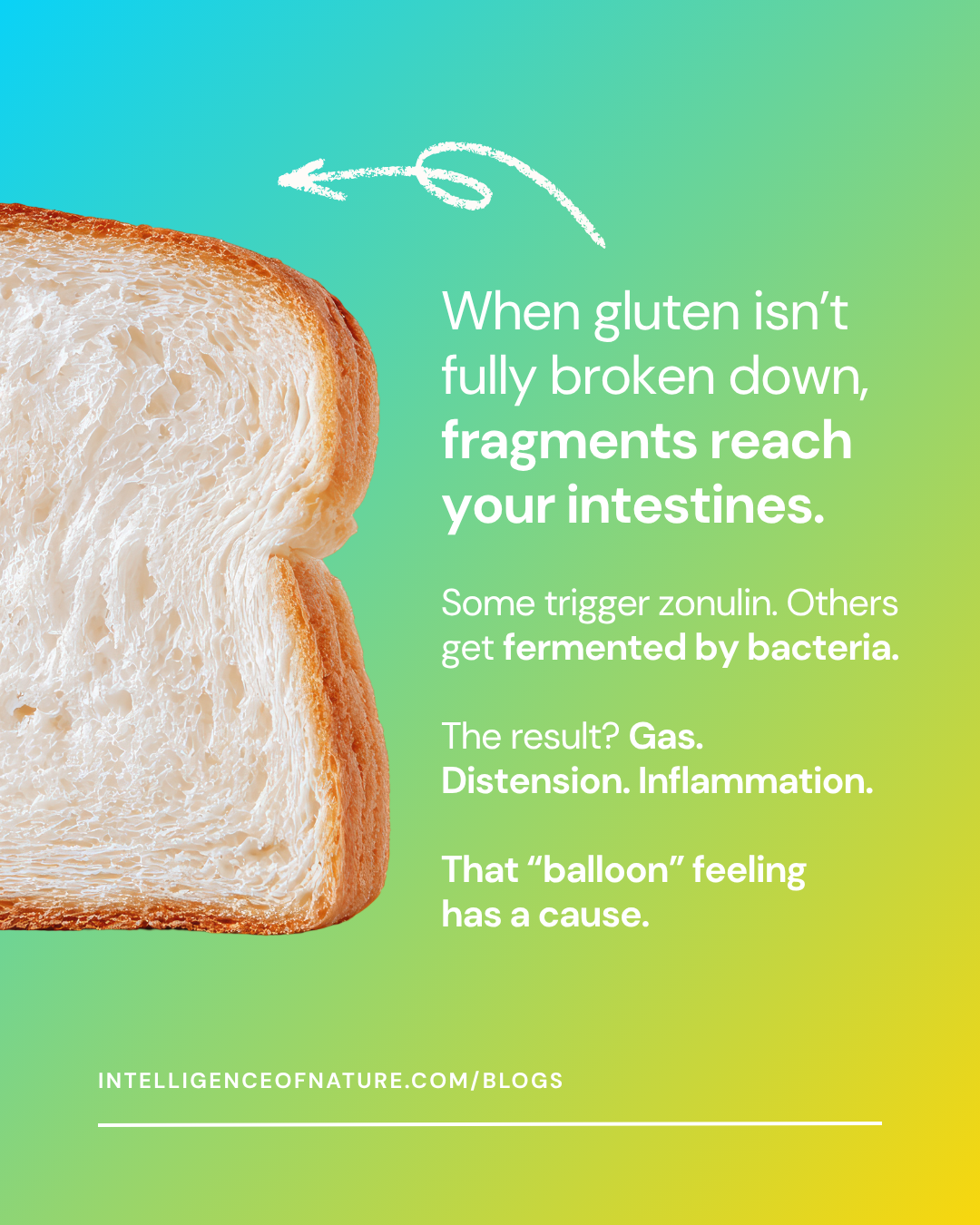
The organic social content gave the brand room to slow down and go deeper. The fermented foods carousel and gluten education series used editorial-quality photography and layered typography to turn complex gut health science into scroll-stopping content.
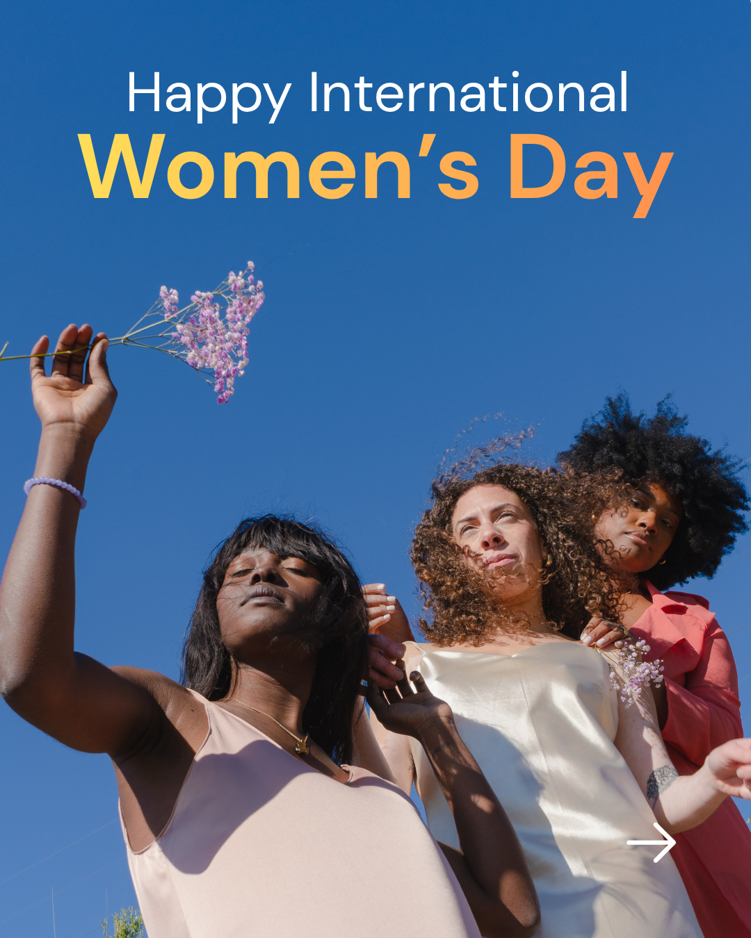
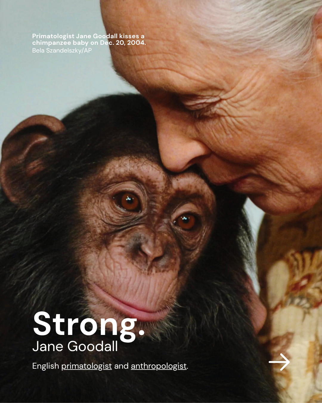
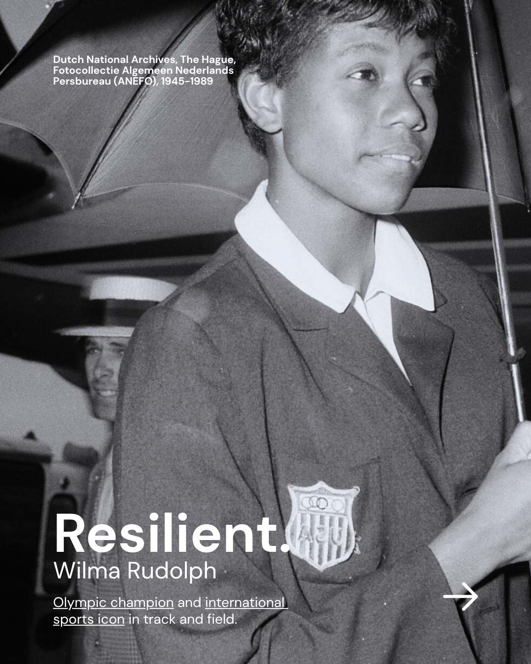
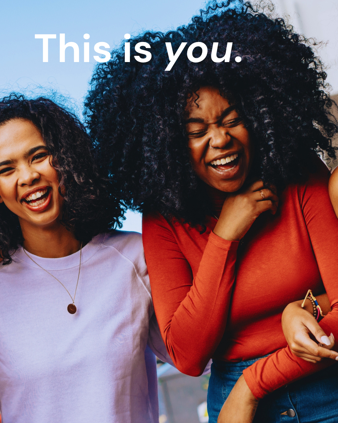
The International Women's Day series shifted the tone entirely, celebrating real women with a black-and-white photographic approach that felt personal and grounded. Across all of it, the goal was the same: build a brand people want to follow, not just buy from.
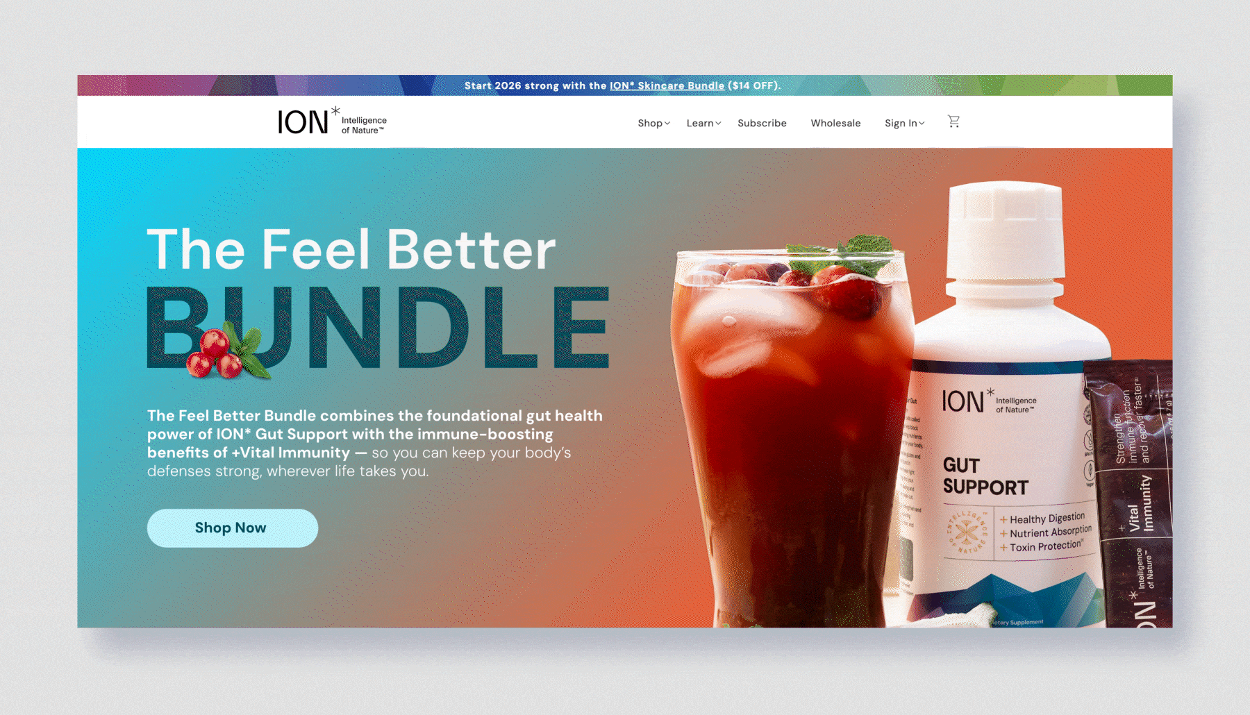
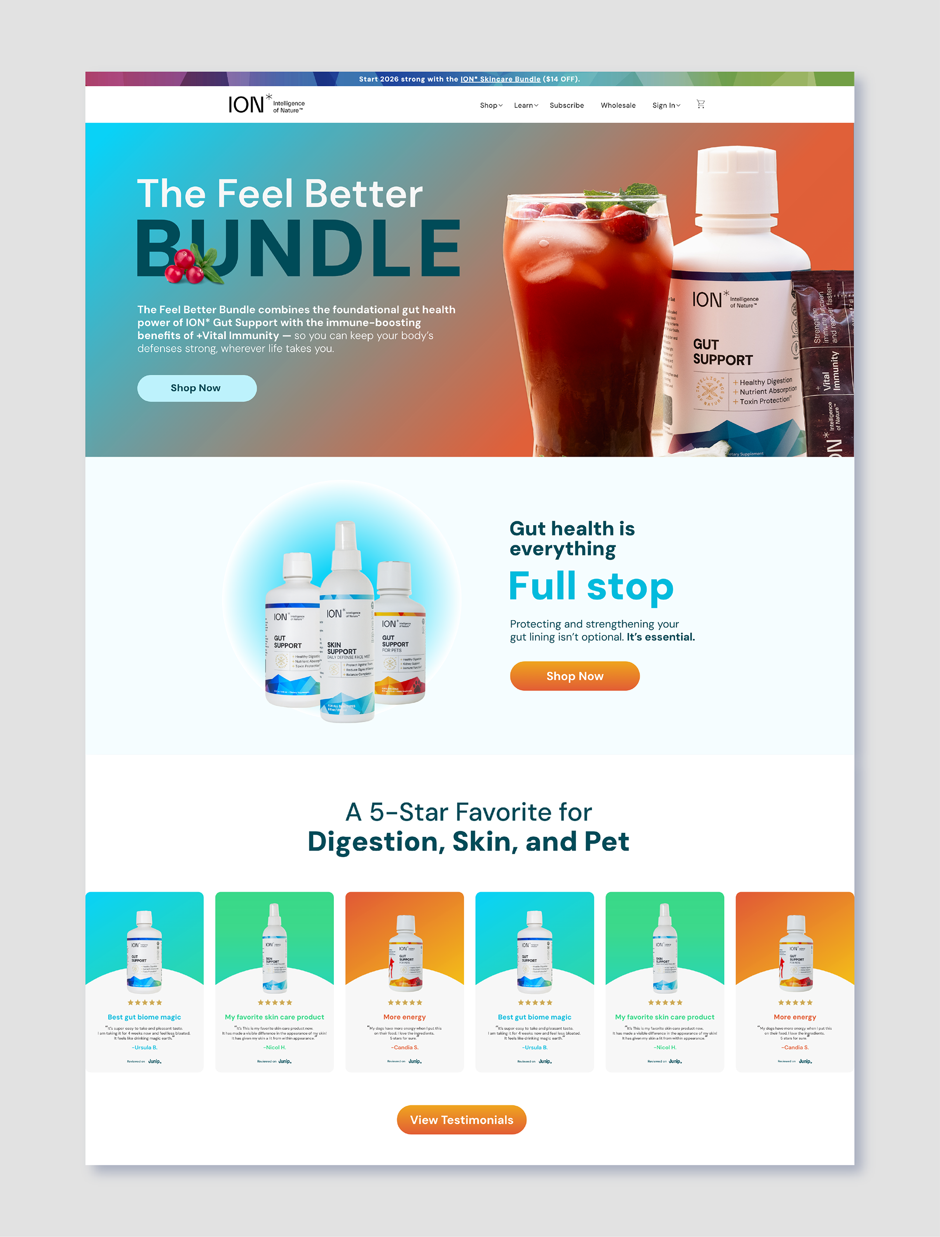
Website Landing Page
The landing page brought the full brand refresh together in one place, a gradient hero banner, product photography, bold typography, and customer testimonials all working within a single scrollable experience. It was designed to do the job of an entire sales funnel: introduce the Feel Better Bundle, establish credibility through social proof, and drive conversions, all while feeling like a natural extension of the email and social campaigns visitors may have arrived from.