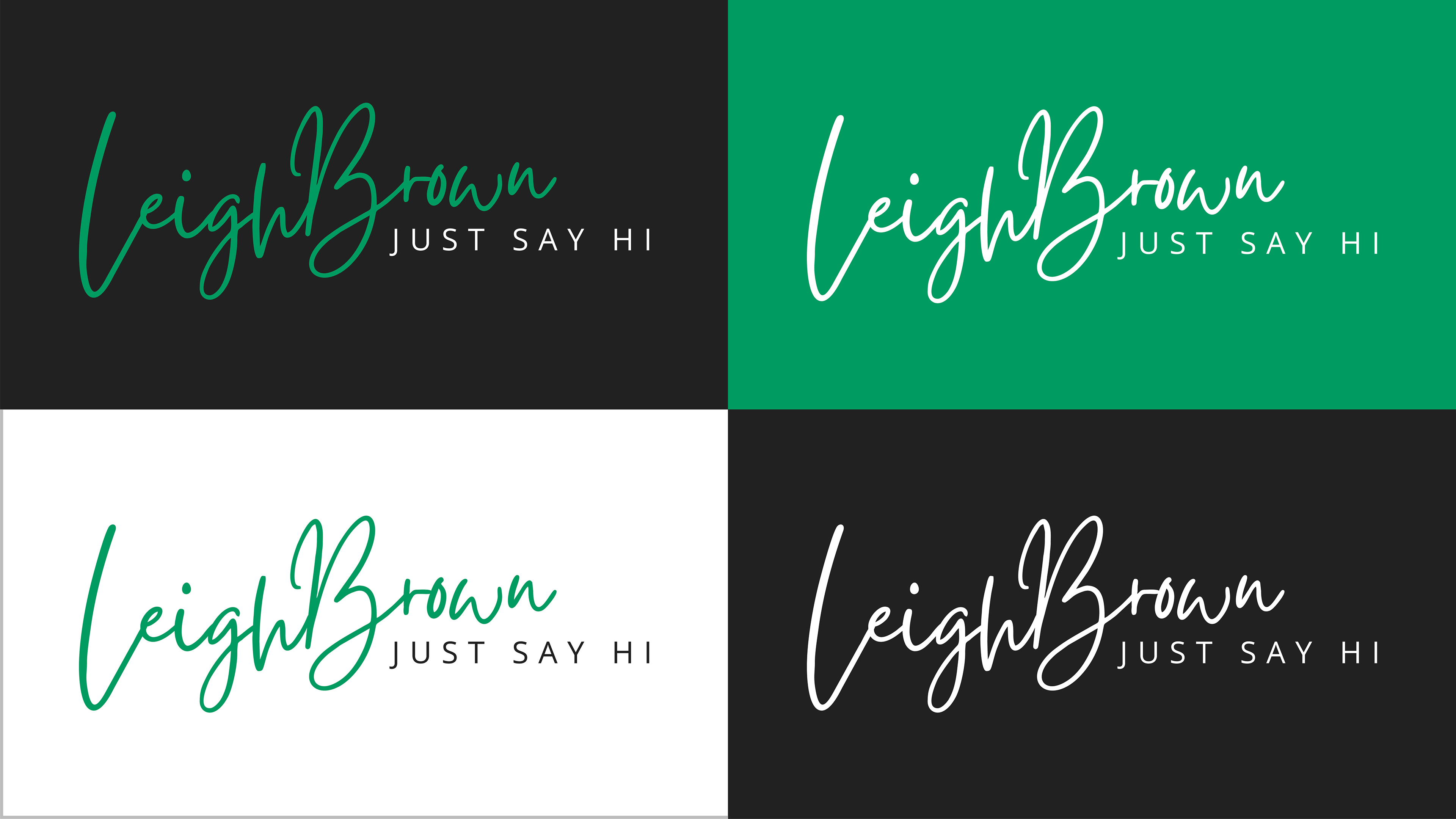
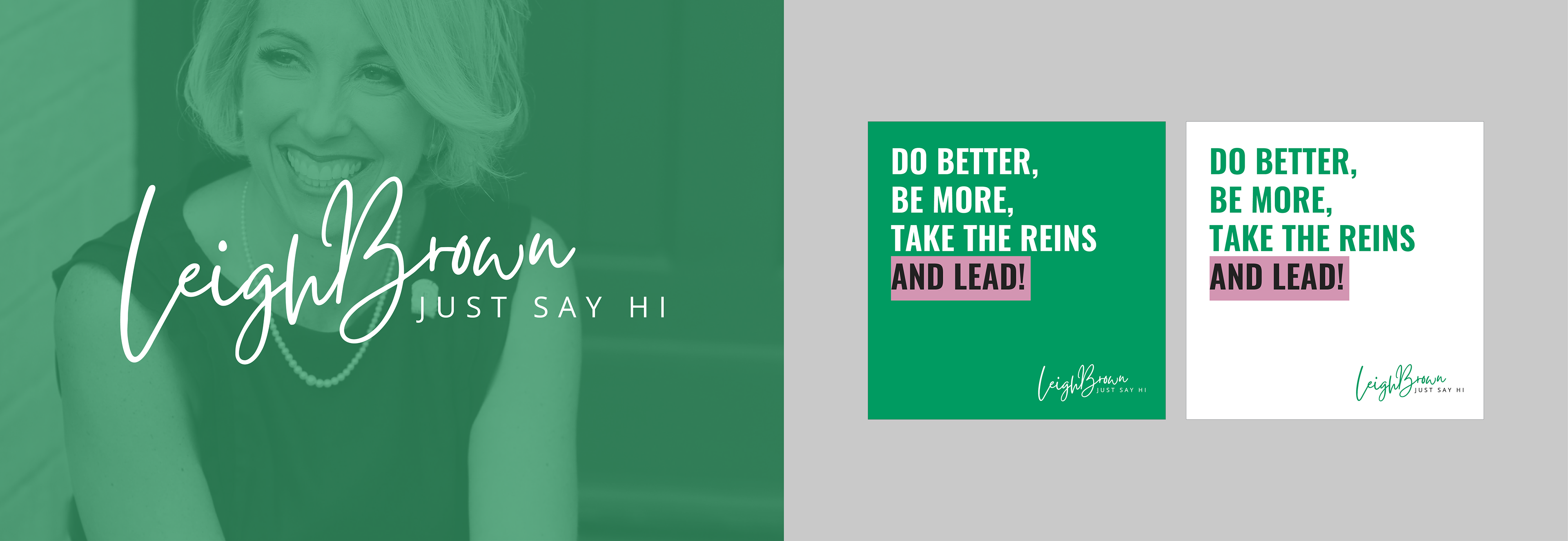
The logo was designed in full color and one-color versions, each tested across dark, light, and brand green backgrounds to ensure it holds up in any context, from a social media avatar to a printed mailer.
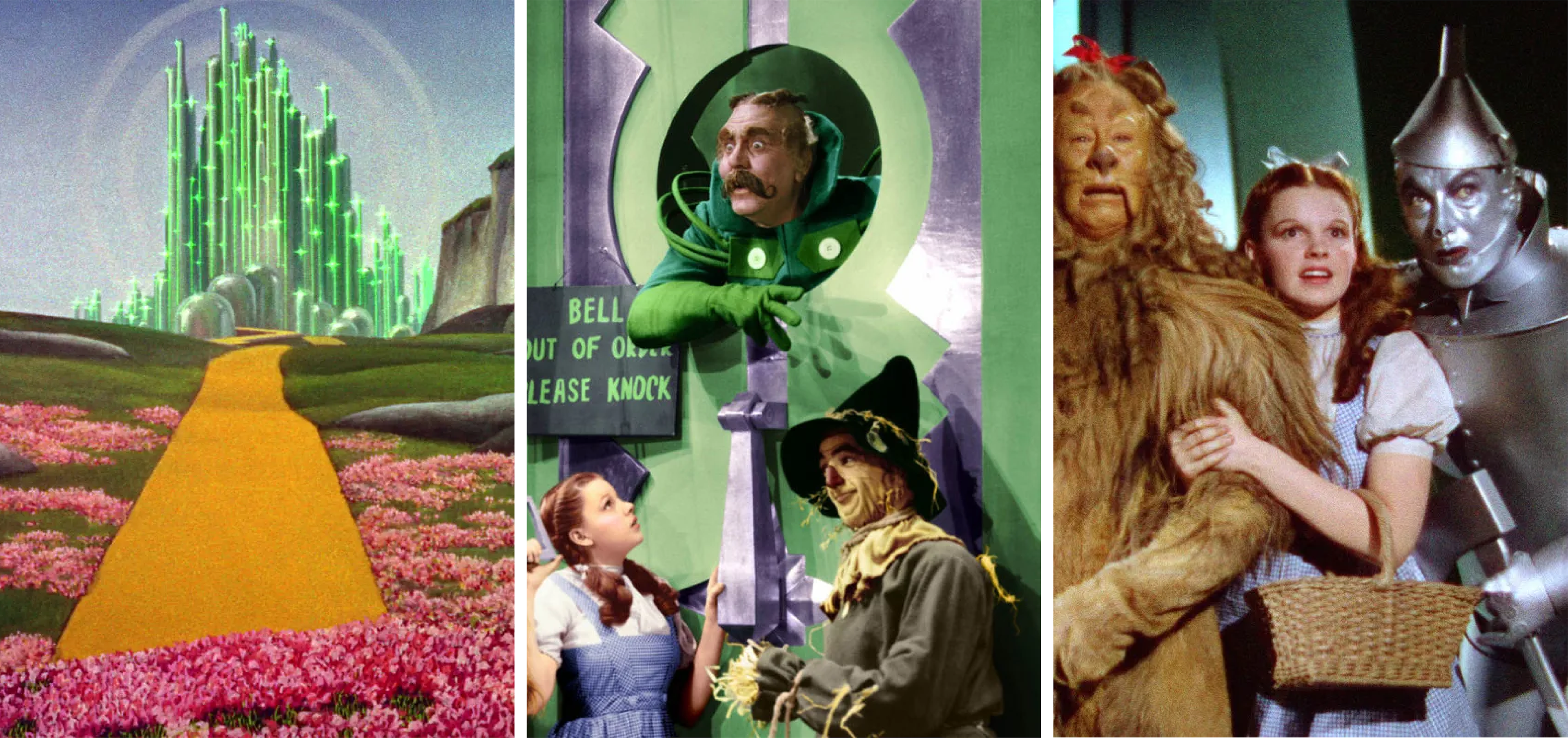
Creative Direction: The Wizard of Oz
The creative direction came straight from Leigh herself: green that evokes power, success, and "maybe even a spark of Wizard of Oz." That reference became the starting point for the brand's color exploration, not emerald literally, but the feeling behind it: bold, magnetic, impossible to ignore. The mood board grounded the visual direction before a single asset was designed, ensuring the brand would feel intentional from the start.
Brand System
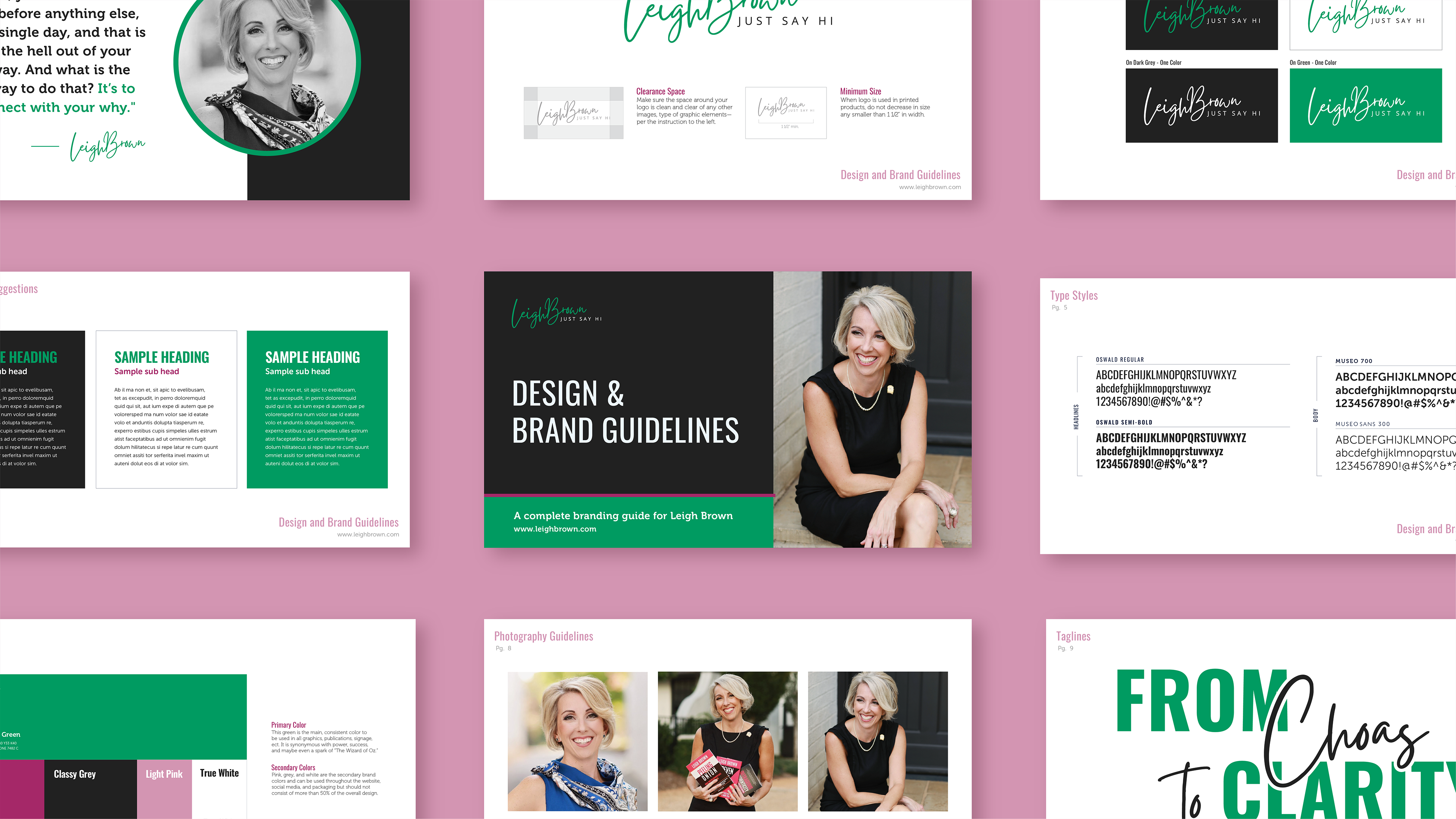
Once the brand system was established, I documented everything in a comprehensive design and brand guidelines book, covering logo usage, color, typography, photography direction, and taglines. The social media templates translated the brand into platform-ready formats, giving Leigh's team a consistent visual language they could use across Instagram and beyond without needing a designer for every post.
Taglines
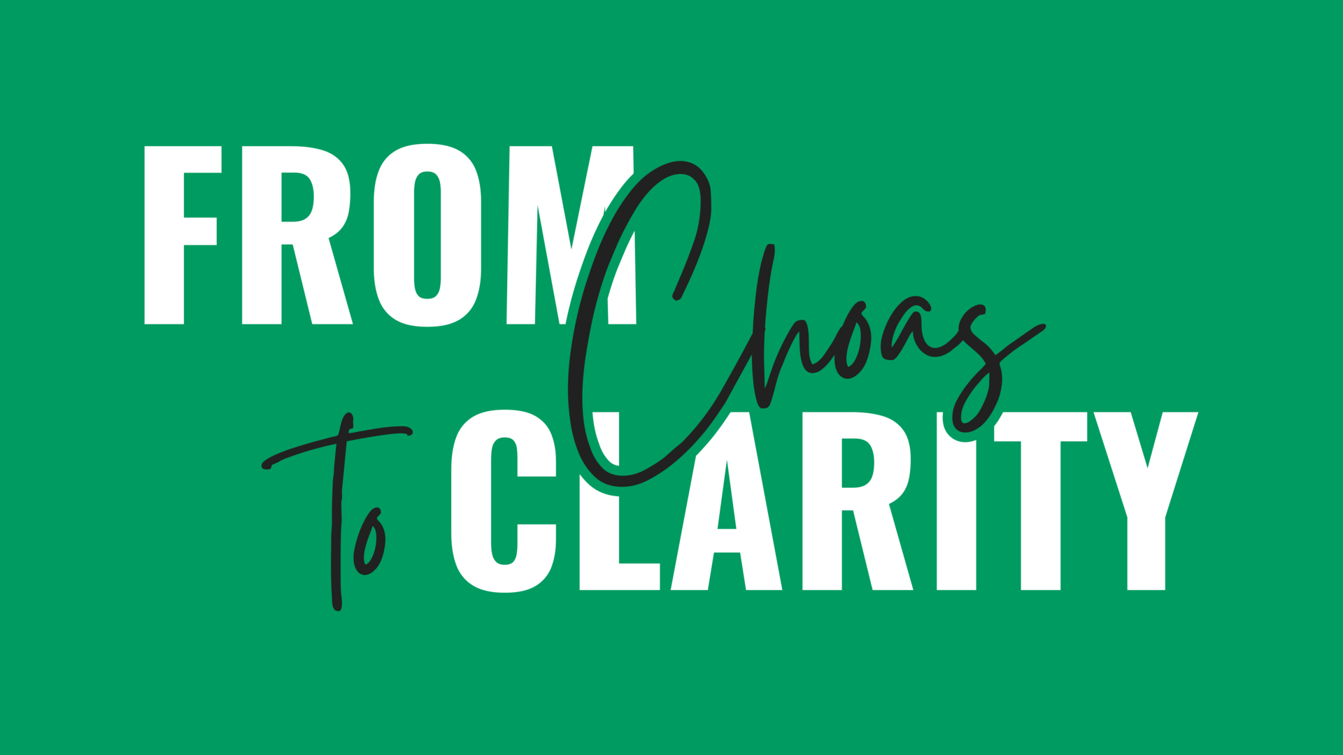
The taglines were designed to work as a system, each one capturing a different facet of Leigh's personality and brand. "From Chaos to Clarity" anchors her core message, "Guts, Grace, and Grit" speaks to who she is, and "Direct, Warm, and Bold" tells you exactly how she shows up. Together they give the brand a verbal identity as strong as the visual one — consistent in tone but flexible enough to work across a business card, a sticker, or a stage backdrop.
Collateral
The business card pairs Leigh's signature tagline "From Chaos to Clarity" on the front with clean contact details on the back, bold and direct, just like her. The custom sticker set was designed as a personality-driven extension of the brand, featuring an illustrated portrait, podcast and book icons, and phrases like "Guts, Grace, and Grit" — the kind of thing people actually keep and stick somewhere visible.
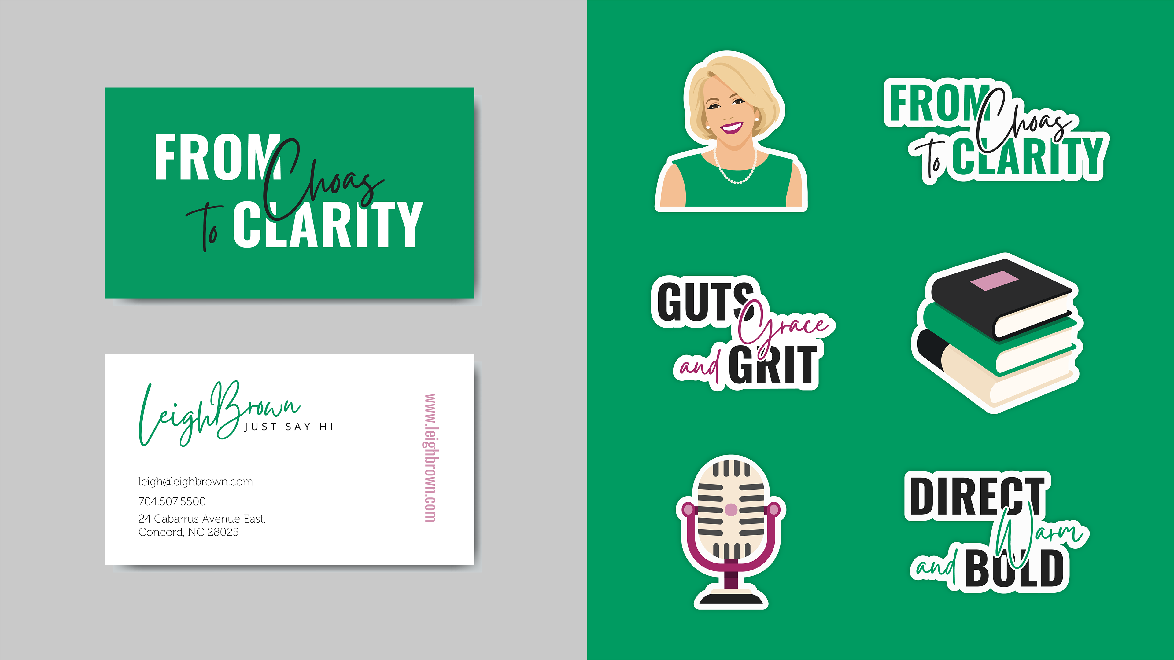
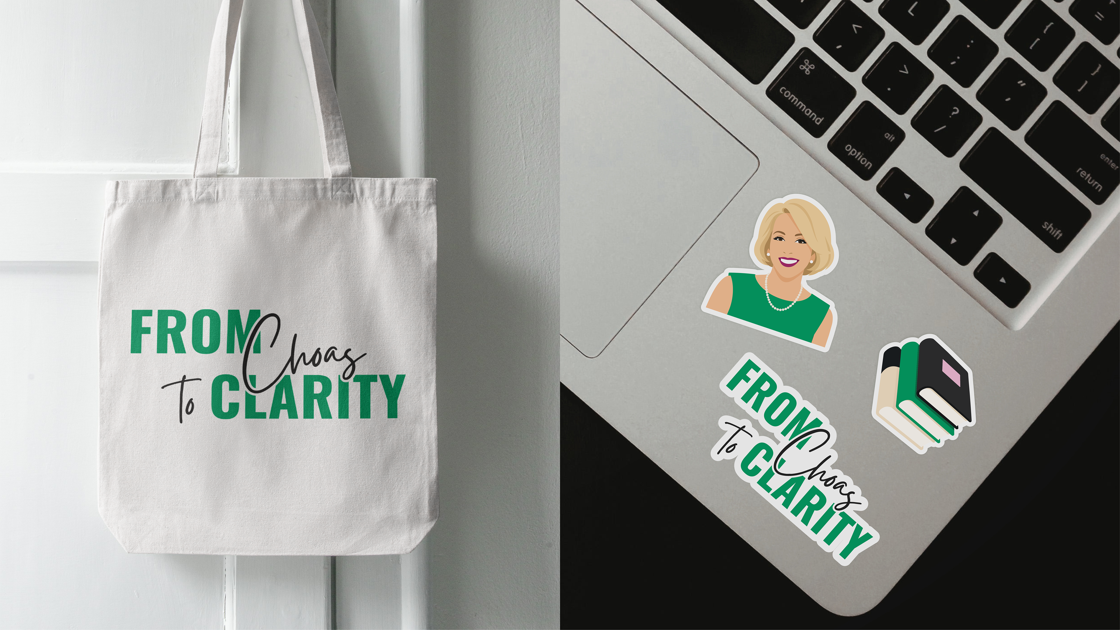
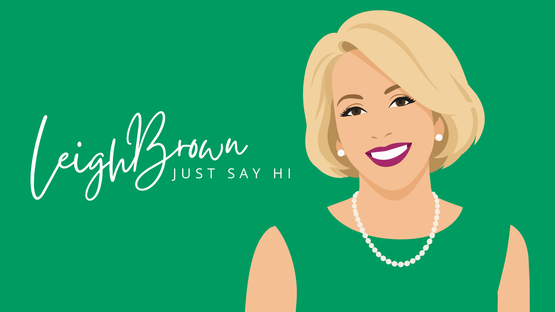
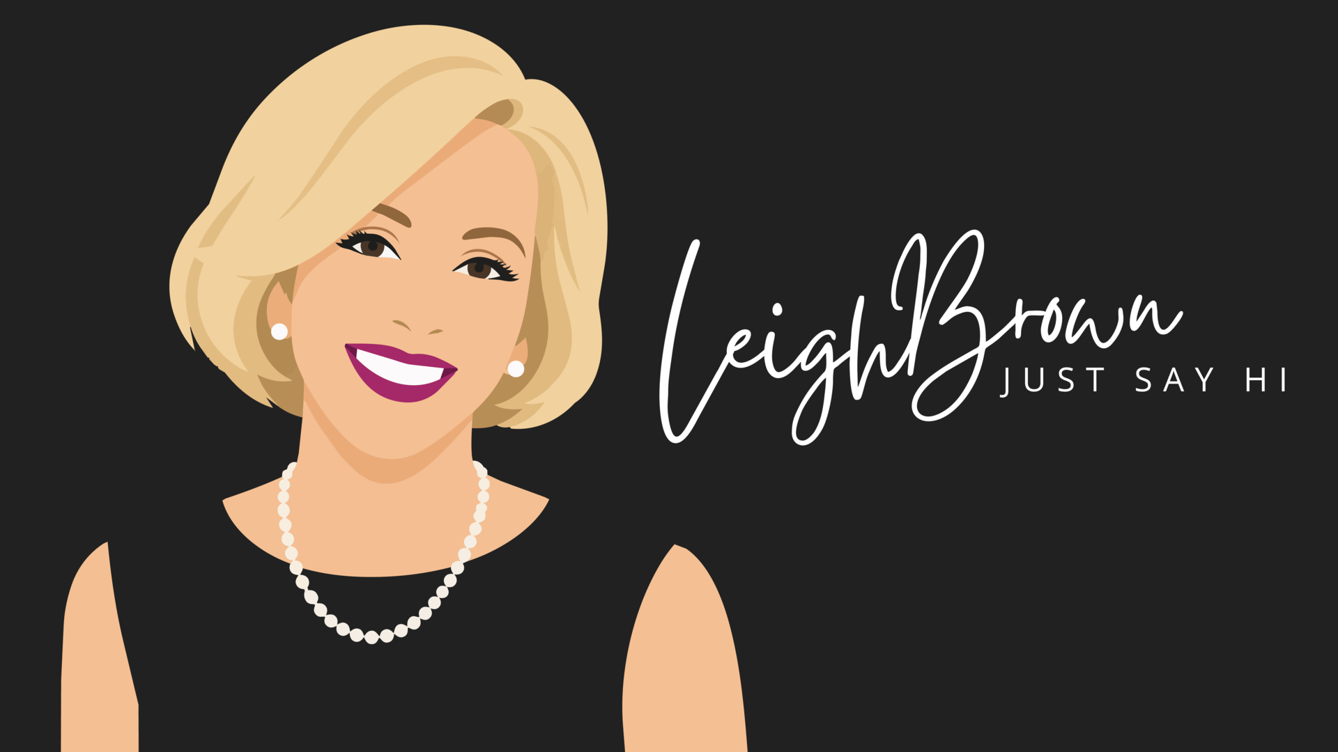
The custom illustrated portrait became the signature element tying the whole brand together, appearing across stickers, social media, and collateral. It captures Leigh's warmth and energy in a way photography alone can't, giving her brand a distinctive visual asset that's instantly recognizable and entirely her own.