
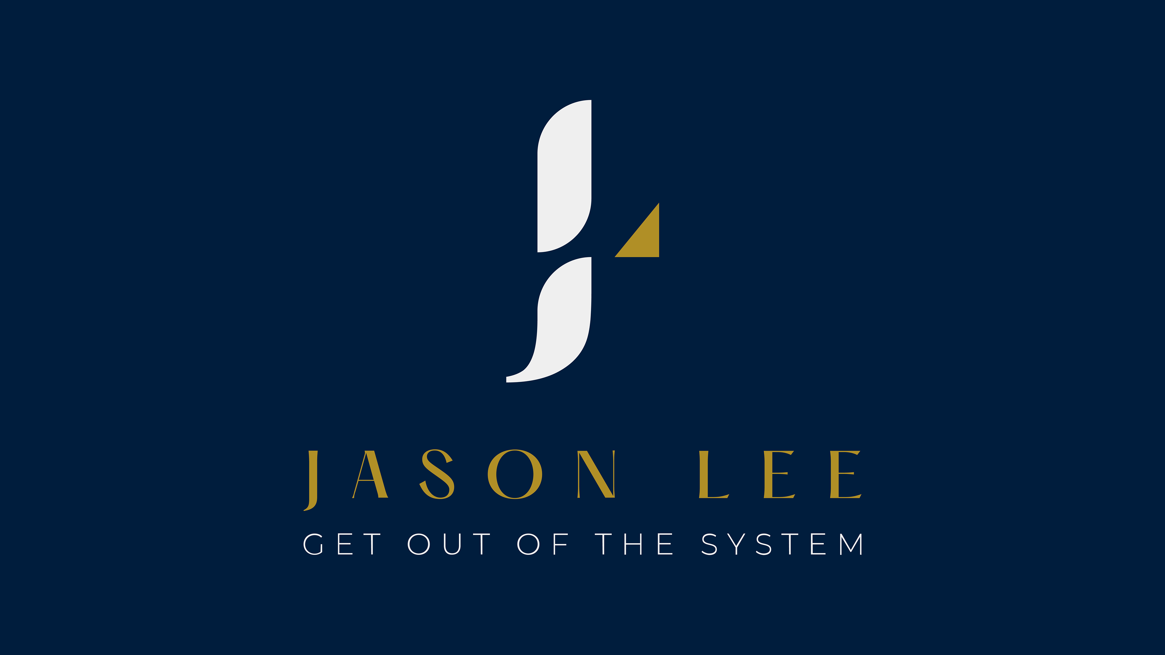
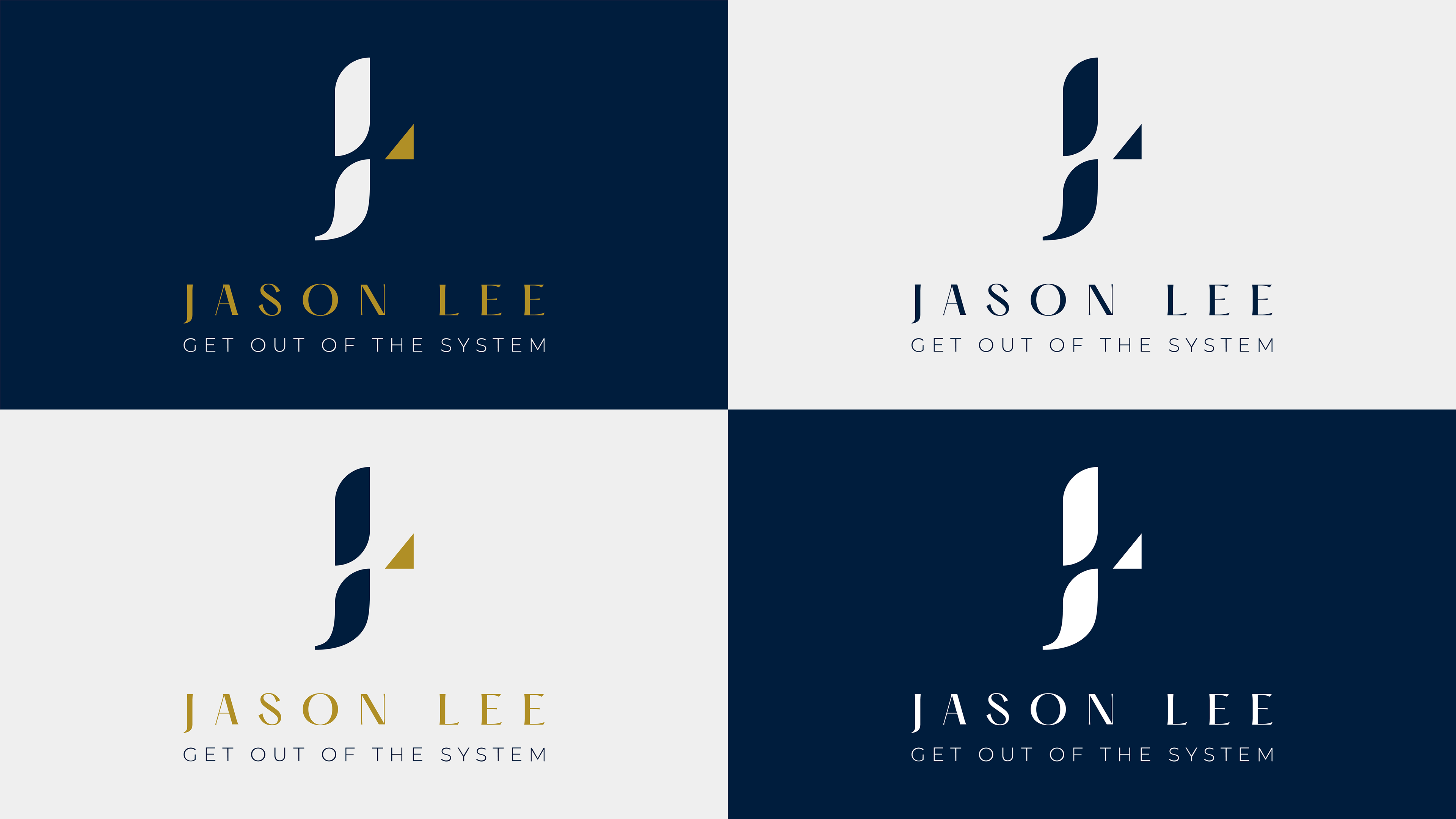
The logo was designed in full color and one-color versions, each tested across dark, light, and brand navy backgrounds to ensure it holds up in any context, from a social media avatar to a printed mailer.
Creative Direction: Trust, Simplicity, Authority
The brand needed to convey trust, integrity, and simplicity while reaching an audience of young professionals looking to break into real estate. Jason had to come across as both credible and approachable, that tension drove the visual direction: a navy and gold palette that commands respect, paired with a custom "JL" monogram clean enough to scale from a book cover to a social avatar.

Color System
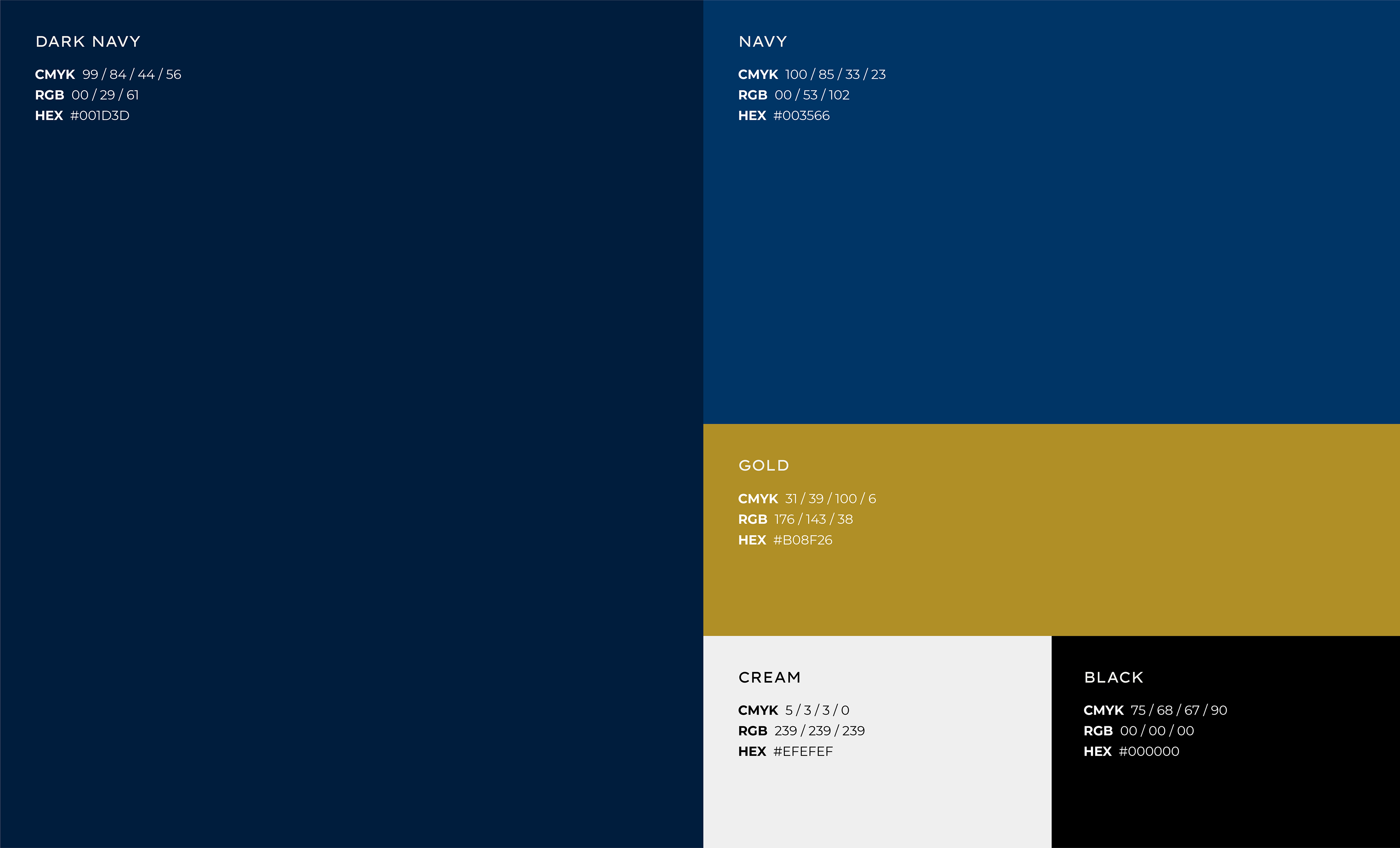
The color system pairs a deep navy with gold and white, giving the brand weight and warmth without tipping into excess.
Brand System
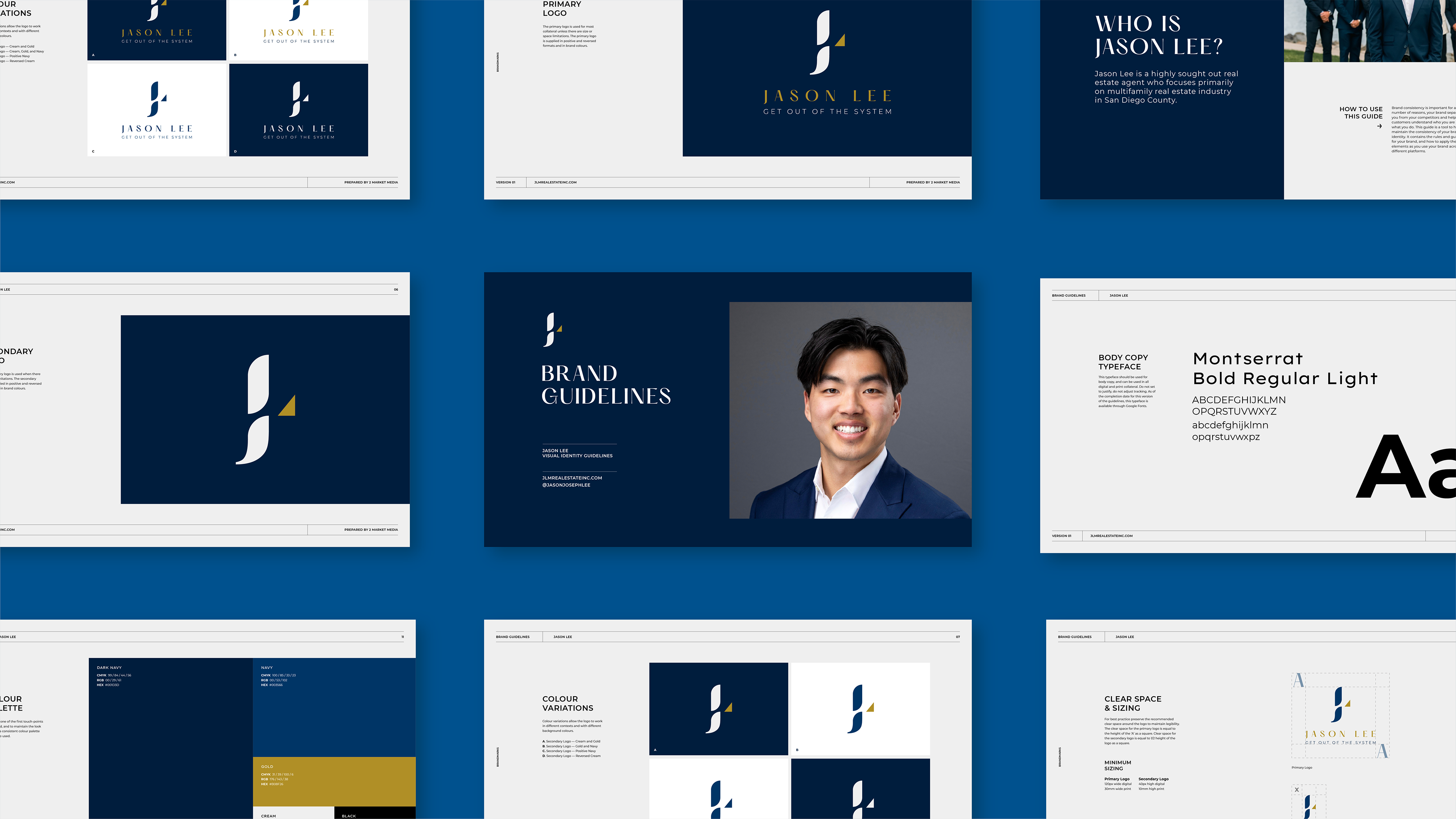
Montserrat was selected as the brand typeface across bold, regular, and light weights, keeping things clean and modern while complementing the geometric quality of the monogram. Social media templates were designed alongside the guidelines so the brand could launch with consistency already baked in. That included casting call graphics for Jason's new series, which put the system to work immediately in a real-world application.

Logo
The monogram merges a "J" and "L" into a single fluid form, with the navy letterforms shaped by soft, sweeping curves that give the mark a sense of movement and confidence. A gold triangular accent sits at the intersection, adding a point of contrast that catches the eye and reinforces the premium feel of the palette.

Collateral
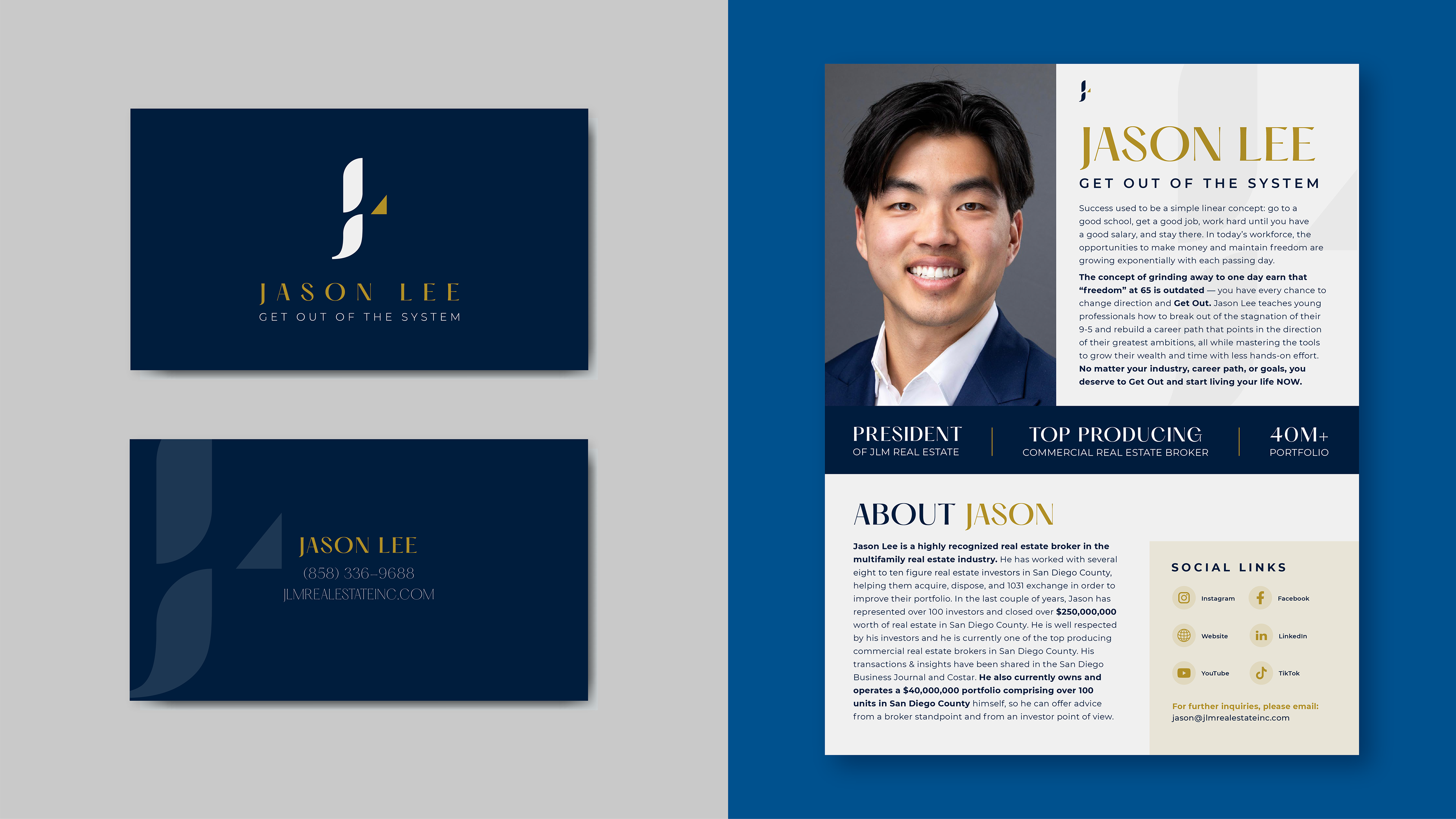
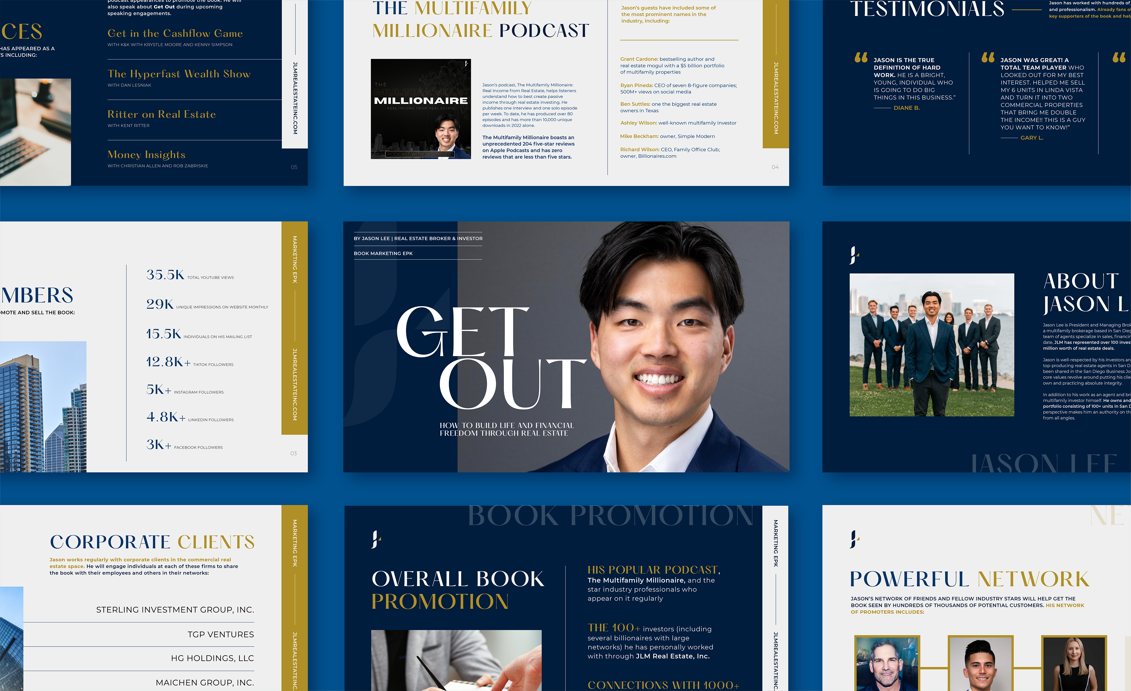
The brand system was applied across a suite of collateral designed to support Jason's book launch and media outreach. Business cards carry the monogram and navy-gold palette in a clean, confident layout. The centerpiece is a multi-page electronic press kit (EPK) built to pitch "Get Out" to publishers, podcast hosts, and media contacts. It walks through Jason's bio, platform reach, podcast appearances, client testimonials, corporate relationships, and promotional strategy, all formatted to feel like a polished pitch.
Website Banner Ads
A set of banner ads was designed to promote casting for Jason's new series, adapting the brand system to a direct-response format. Each variation balances the navy-gold palette with strong typographic hierarchy and a clear call to action, while alternating between cityscape-only and portrait-forward layouts to give the campaign flexibility across placements.